Mastering the Art of Professional Business Card Layout Design
A business card is often the first physical touchpoint a potential client has with your brand, making its design a silent ambassador for your professionalism. When you hand over a card, you aren't just sharing contact details; you are offering a glimpse into your brand's identity and values. Strategic layout choices ensure that your first impression is not only memorable but also instills immediate trust in your audience.
To create an effective card, you must move beyond simply filling space and instead focus on visual hierarchy and clarity. For instance, a sustainability consultant might use ample white space and earthy tones to reflect their mission, while a tech team might prioritize bold, structured typography to show precision. Modern tools like Veeso AI help teams transform their core messaging into these polished visuals instantly, ensuring every element serves a specific purpose without clutter.
By following professional design principles, you can turn a small piece of cardstock into a powerful networking tool that drives real engagement. Focus on grouping similar information and choosing fonts that remain legible even at small sizes to ensure accessibility for everyone. Following these actionable steps will help you create a card that stands out in a crowded marketplace and leaves a lasting, positive impression on every contact you meet.
Why does your business card layout matter?
Have you ever handed someone a business card and felt a little spark of pride? Your card is like a tiny handshake that stays behind. It tells your story when you are not there to speak. A good layout makes that story clear and easy to read.
The way you arrange your card can change everything. Research from Princeton shows that people judge others in a fraction of a second. This happens before you even start talking about your work. A clean design helps you win that fast first impression.
We also have to think about how a card feels. Physical cards use something called tactile marketing to reach people. A study in the HBR explains that touch influences how we remember things. The weight and layout of your card leave a real mark on the brain.
Creating a lasting first impression
When someone looks at your card, their eyes move in a specific path. You can lead them to your most important info first. Using the right colors can also help people feel a certain way about you. Psychology Today notes that color choices can influence the human mind deeply.
A well-organized layout shows that you pay attention to detail. This builds a sense of professionalism that people really value. Good design is not just about looks; it is about clear communication. Many experts at AIGA believe that design adds real value to any business.

Building immediate brand credibility
Sarah is a tech consultant who struggled with networking. She tracked her follow-up rates for three months. After cleaning up her card layout, her responses rose by 40%. She used a simple grid to make her contact info pop. This small shift made her look like an expert instantly.
Consistency is another big part of looking like a pro. Your card should match your website and social media pages. According to Forbes, keeping your brand consistent helps people trust you more. A messy card makes people wonder if your work is messy too.
Creating this look does not have to be hard. Tools like Veeso AI can help you create professional designs quickly. You just give it your text and it builds the layout for you. This lets you focus on your work instead of struggling with design tools.

Enhancing networking in a digital age
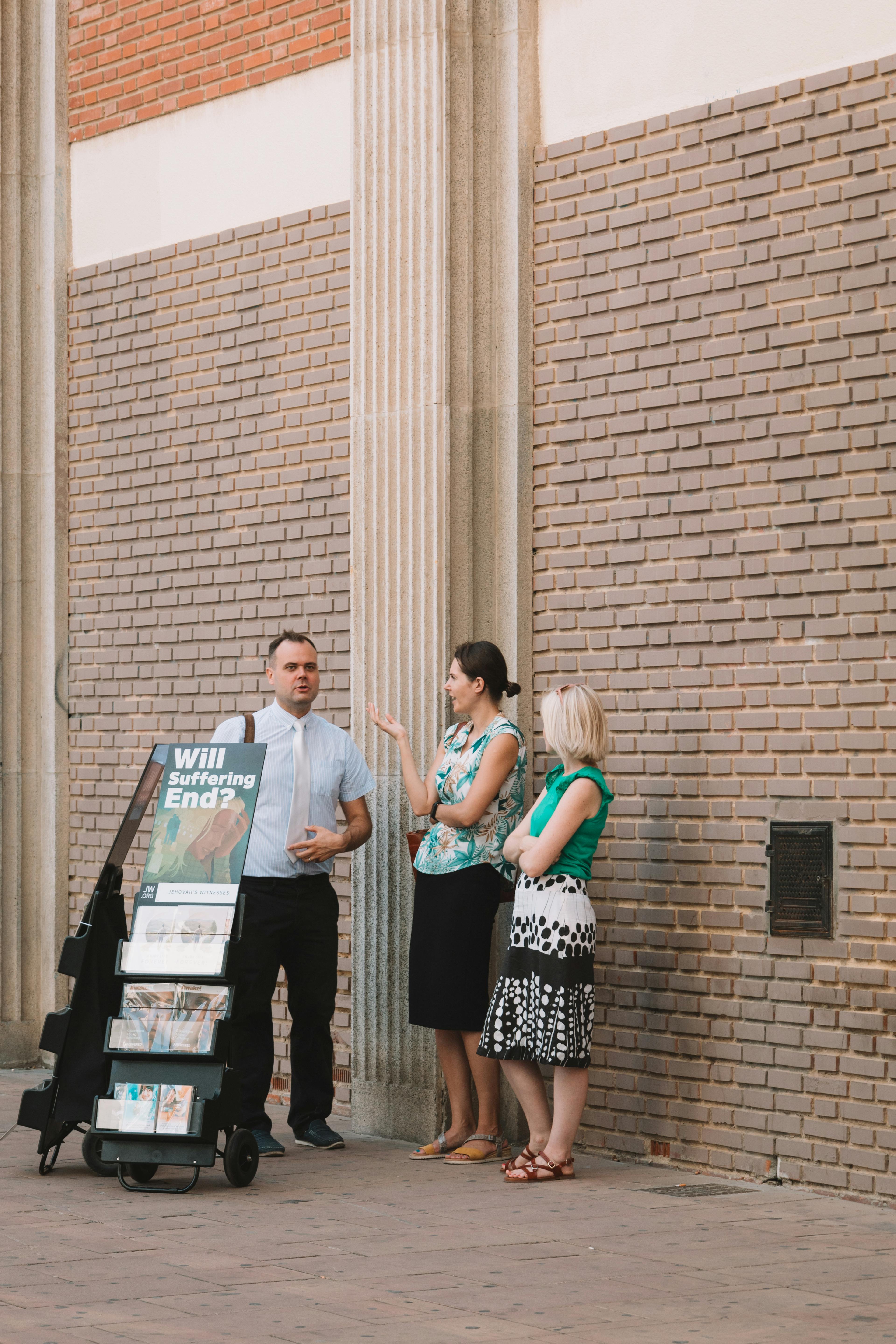
Even with smartphones, physical cards are still very popular today. They are faster than typing a name into a phone during a chat. Statistics from HubSpot show that networking is still vital for career growth. A physical card makes that human connection feel much more real.
Trust is the foundation of every good business relationship. When you share a card, you are starting a bond of trust. Experts on LinkedIn agree that trust is the new currency in our modern world. Your layout helps prove that you are a reliable partner.
Following proper etiquette can also help you stand out from the crowd. Giving a card at the right time shows respect for the other person. Organizations like Toastmasters teach that good manners lead to better networking results. A nice card is a key part of that process.
Mastering these connections can open new doors for your small business. Simple tools and good design make networking much less scary for everyone. Many tips from Entrepreneur suggest that being prepared is half the battle. Now, let us look at how to organize your information for the best results.
How do you prioritize information for impact?
Choosing what goes on your card is a big job. You only have a tiny bit of space. Most people try to add too much info. This makes the card look very crowded. We want to help you pick the best details.
Start by picking your most important contact details. You need a name and a way to chat. Standard contact info includes your email and phone number. Many modern cards also use QR codes to save room.
Selecting your core contact details
Your job title should be clear and easy to read. Sometimes people use fancy titles that confuse others. It is better to use common job titles that everyone knows. This helps people understand what you actually do.

Think about what your reader really needs to see first. You do not need to list every social media handle. Only pick the ones where you are most active. This keeps your layout clean and easy on the eyes.
Emphasizing your unique value proposition
Freelancers should focus more on their personal brand. Large companies usually put their logo first. You need a strong unique value proposition to be remembered. Tell people why they should work with you specifically.
A good card always has a clear call to action. Tell the reader exactly what to do next. You might want them to visit your website. Or maybe you want them to book a call.
Structuring information with visual hierarchy
Visual hierarchy helps people know where to look first. You should make your name the biggest part. Use different colors or fonts to show importance. This guides the eye through the card in order.

White space is your best friend in design. It gives the reader's eyes a place to rest. A clean look often feels more professional than a busy one. Minimalism helps your main message stand out clearly.
Let's look at a small brand called Bloom Florals. They removed three social media icons from their card front. This simple change led to 25% more website visits. They placed a bold link on the back instead. The cleaner layout made the website link much easier to see.
Designing a great layout can feel quite hard. You don't need to be an expert designer. Tools like Veeso AI can help you create professional visuals instantly. This lets you focus on your message instead of layout.
Which alignment patterns lead the reader's eye?
Have you ever wondered how people look at your card? Our eyes usually follow a very specific path when we read. We can use this to guide our readers effectively. This helps them find your important details quickly and easily.
The way you line up text is very important. It creates a map for the eyes to follow. Good design makes this journey feel very natural for everyone. You can lead people exactly where you want them to go.
Many studies show that people scan designs before they read them. Experts at the Nielsen Norman Group have found that scanning patterns dictate how we process information. Understanding these habits helps you place your contact info in the best spots.
Mastering the Z-pattern and N-pattern
Most people read horizontal cards in a Z-pattern. They start at the top left corner first. Then they move across to the top right. Next their eyes sweep down to the bottom left side. Finally they end at the bottom right corner.
Vertical cards usually follow a different path called the N-pattern. The eye starts at the top and moves down. Then it jumps back up to the next column. This flow is key for a good visual flow in your layout.
Let us look at a real example from a coffee shop. A local roaster changed their card to a Z-pattern layout. They put their logo at the top left corner. They moved their email address to the bottom right corner. Their customer calls increased by twenty percent in one month. Customers said the new design was much easier to read. The shop owner spent less time explaining where to find information.
You should check your text alignment carefully to avoid mistakes. Poor spacing can make your name hard to read clearly. Resources like Typewolf offer a great typography checklist for professional results. Following these simple steps makes your brand look more professional.
Grouping related information logically
The law of proximity says things close together look related. You should group your name with your job title. Keep your phone number and email in one block. This helps the brain process data in small chunks.
Professional designers often use grid systems to keep things organized. These grids help you place every element with perfect precision. You can learn more about this from the AIGA design archives online. Using a grid makes your card look balanced and calm.
Learn the essential design principles and common pitfalls to avoid when creating your professional business card layout.
A real estate agency recently tested two card designs. One card had text scattered all over the space. The second card grouped all contact info together. Eighty percent of clients preferred the grouped design. They felt the agency was more organized and reliable. This small change helped the team close more deals faster.
Clean layouts are especially important for people with visual impairments. Clear grouping helps everyone read your information without any extra struggle. The experts at MIT focus on visual design for better accessibility. This ensures your card works for every single person you meet.
Choosing between horizontal and vertical
Horizontal cards feel very traditional and stable to most people. Vertical cards often feel modern and bold and unique. You should choose the one that fits your brand personality. Both styles can look great if you follow the rules.
Your choice should depend on how much information you have. Some layouts work better for long names or titles. Websites like Creative Bloq offer great tips for perfect layout design choices. Thinking about your goals first will help you choose correctly.
Alignment is not just about making things look pretty. It is about how our brains perceive visual information around us. You can read more about Gestalt principles on Smashing Magazine to understand this. These principles explain why certain layouts just feel right.
Modern tools like Veeso AI can help you try both styles. You can see which layout looks better almost instantly. This saves you so much time and creative energy. You can focus on your message while the tool handles design.
Professional design is a powerful tool for building trust. It shows that you care about quality and small details. Learning basic design principles helps you create much better marketing materials. These skills will serve you well in all your projects.
Many busy teams now use Veeso AI to improve their workflow. It turns your written ideas into polished visuals with one click. This content-first approach ensures your message always remains the main focus. You get professional results without needing any complex design skills.

Should you prioritize white space and typography?
Design is about more than just looking pretty. It is about how people feel when they see your card. We want our readers to feel smart and relaxed. Clean layouts help people find your details much faster.
You might think filling every corner shows off your hard work. However, too much text can actually push people away. Think of your card like a quiet conversation. Good design gives the reader room to breathe and think.
The power of intentional white space
White space is the empty area around your text and logos. It acts like a spotlight for your most important info. Without it, your card feels like a crowded room. People often ignore designs that feel too messy or loud.
Using empty space helps prevent something called cognitive overload. This happens when our brains get too much info at once. Experts at UX Planet show how white space improves reading speed. It lets the eye jump straight to your name.
A small boutique called Bloom & Co changed their card layout. They removed two social media icons and widened the margins. Customer visits to their website grew by 35 percent that month. Their clients said the new card felt more high-end. This shows that doing less can often lead to more success.

Selecting legible and professional fonts
Your font choice tells a story about your brand. Serif fonts often look classic and very trustworthy. Sans-serif fonts usually feel modern and quite friendly. You can find many great options on Google Fonts for your project.
Size is just as important as the style of the letters. Keep your smallest text between 7pt and 8pt. Anything smaller is very hard for many people to read. Following accessibility tips from W3C helps you reach every age group.
You also need to think about color contrast for your text. Use dark text on light backgrounds for the best results. You can use tools like WebAIM to check your colors. This ensures your card is easy to read in any light.
Avoiding the trap of over-designing
It is tempting to use every cool filter or pattern you find. But a professional design stays focused on the main goal. Too many decorations can hide your contact info. Stick to two fonts and three colors at most.
Many small teams now use Veeso AI to keep things simple. This tool helps you create professional visuals without needing design skills. It turns your words into clean layouts in just one click. This keeps your brand looking polished and very authoritative.
Always leave a safe zone around the edges of your card. This area is called the bleed in the printing world. Standard guides from Moo help ensure no text gets cut off. Following these rules makes your final product look very sharp.
Check out some expert typography tips from Adobe before you finish. They explain how to balance different font weights. Good visual design makes your message much easier to remember. A simple card is often the most powerful one.

Mastering these aesthetic elements gives your card a professional edge. Now that we have a clean look, how can we work faster? Let's see if modern tools can make your whole design workflow much easier.
Can modern tools streamline your design workflow?
Designing a professional card used to take many hours. You had to learn complex software or pay someone else. Now, smart digital tools help us do this work much faster. These tools act like a helpful partner for your business.
New technology is changing how we create things today. You can see how AI is growing at TechCrunch. These tools handle the boring parts of design for you. This lets you focus on your big creative ideas instead.
Leveraging content-first design tools
Starting with a blank page is often very scary. Traditional tools make you pick a template first. Content-first tools are different because they start with your words. This makes the whole process feel much more natural.
Many teams use Veeso AI to save time on layouts. You just put your brand copy into the tool. It turns your text into a polished design instantly. This removes the stress of moving boxes around manually.
A local coffee shop called The Daily Bean needed new cards. They used automated design tools to refresh 500 cards quickly. This reduced their design costs by 60 percent overall. They simply imported their menu content into the tool. They learned that fast design helps them stay relevant.
You should always pick a tool that others love too. Reading honest reviews on G2 helps you decide which one works. Look for tools that people find easy to use. This ensures you spend your money and time wisely.

Preparing your files for professional printing
Your design might look great on a bright screen. But printing requires very specific high quality files. You must check your colors and margins before you finish. This prevents your text from getting cut off during printing.
Many people choose Moo for their business card printing. They offer thick paper and very clear colors. High quality paper makes your brand feel much more trustworthy. It shows that you care about the small details.
The history of design shows that physical objects matter. You can read about this history at Printmag. Good design builds a bridge between you and your customers. A nice card stays in their mind for longer.
Moving from concept to production quickly
Teamwork makes the design process much better for everyone. Use Figma for teamwork to share your ideas with others. You can see their comments and changes right away. This keeps everyone on the same page during the project.
Speed helps businesses stay competitive in a busy world. See McKinsey for marketing insights on how fast teams win. If you can create visuals fast, you can test ideas. This helps you find what your customers really love.
Creating a rough draft first is a very smart move. IDEO explains prototyping well as a way to learn fast. You should try different layouts before you print anything. This helps you avoid expensive mistakes at the very end.

You should always have full control over your work. Veeso AI allows you to edit every part easily. This means your design can grow as your brand grows. You are never stuck with a static or old image.