How to Choose the Perfect Brand Color Palette

Choosing the right colors defines your brand's personality and builds immediate trust with your audience. Professional color palettes ensure your marketing materials look polished and cohesive across every platform. You might find it helpful to explore Color Psychology to understand how different hues impact consumer behavior and brand perception.
Many small business teams struggle to maintain visual consistency without a dedicated graphic designer on staff. A local bakery recently boosted social media engagement by 40% after switching from random colors to a warm, inviting palette of terracotta and cream. Using tools like Adobe Color can help you find harmonious combinations that resonate with your specific target market.
You can easily elevate your visual presence by applying simple color rules and using smart automation. Start by selecting a primary color that reflects your core values and building your identity around it. For those looking to save time, modern platforms like Veeso AI handle complex layouts automatically so you can focus on your message.
Why does color influence your brand's success?
Color is much more than a simple design choice. It is the first thing your customers notice. This small detail tells your story before you say a word. We use colors to share our values with the world.
Using the same colors across your brand is very important. Research shows that consistent color use can boost your brand recognition by 80 percent. This helps people remember who you are and what you do.
Building immediate brand recognition
Our brains process visual information very quickly. Colors help customers identify your business in a crowded market. A strong brand identity makes your company look more professional and reliable.
Look at Tiffany and Co. for a great example. They use a very specific shade of blue for their boxes. This color is so famous that it has its own trademark. People link this blue with luxury and high quality immediately. They use this color on every box and bag they make.
This consistency builds deep trust with their shoppers. Sticking to one color creates a strong visual memory for your audience. Good visual hierarchy helps your customers find the information they need fast.
Keeping your designs consistent can be hard for small teams. Many busy professionals use Veeso AI to solve this problem. It helps you turn your content into polished designs with one click. This ensures your brand always looks its best for your customers.

Creating an emotional connection
Colors act as a silent language for your brand. They can make people feel happy, calm, or even excited. Understanding color psychology helps you choose the right message for your specific audience.
Starbucks chose green to stand out from other coffee brands. They updated their logo to make the green more prominent. This color choice suggests growth, health, and a calm nature. They even removed their brand name to focus on the color. This choice helped them build a global community of fans.
Using specific brand colors helps you connect with people's feelings. It makes your company feel more human and approachable. Most successful companies use color to share their unique mission and values.

Selecting the right shade is vital for long-term growth. The right color in branding can help you win over new clients. It creates a mood that matches the services you provide.
Visuals play a huge role in how people spend money. Specific colors can actually influence consumer behavior and drive more sales. When your design is clear, your customers feel safe buying from you.
Choosing the right colors is a smart move for your team. It builds trust and makes your brand easy to recognize. Now that we know why color matters, let's see how it shapes what people think of you.
How does color psychology shape customer perception?
Do you ever feel a certain mood when you see a specific color? Colors are more than just a choice for a logo. They act like a silent language for your brand. This language speaks directly to the feelings of your customers.
Your brain processes colors faster than words or shapes. A good color choice can make people feel safe or excited. If you pick the wrong hue, you might confuse your audience. Understanding how color affects behavior is key to creating a successful business.
Colors can even change how we think about a product's price or quality. Many experts look at color psychology to see how it drives shopping habits. This field of study helps us see why we click on some ads but ignore others.
The meaning behind primary colors
Red is a powerful color that shows energy and passion. Brands often use it to create a sense of urgency. This can lead to more sales during a clearance event. Many people feel a faster heart rate when they see bright red signs.
Blue is a very popular choice for many global businesses. It makes people feel safe and helps build long term trust. You often see it on websites for banks or medical companies. These industries want you to know they are reliable and calm.
Green often represents the natural world and fresh starts. It works well for brands that focus on health or nature. Yellow is the color of sunshine and creates a happy feeling. It is great for grabbing attention but can be hard on the eyes if you use too much.
McDonald's uses red and yellow to influence how you feel. Red makes you feel hungry and energized while yellow feels happy. This specific mix encourages you to eat your meal quickly. It helps the restaurant move more people through their doors every day. This clever use of color helps their team reach high sales goals.

Cultural differences in color perception
Color meanings can change when you move across the world. What feels happy in one country might feel sad in another. You should always research your target market before picking a palette. This keeps your brand from sending the wrong message to new fans.
Let's look at the color white as a great example. In the United States, white often stands for weddings and clean spaces. But in parts of Asia, people wear white to show they are mourning. This difference changes how a brand should look in different countries.
Smart marketers check if their colors fit the local culture. A color that means luck in one place might mean bad news in another. Using a guide for social media colors can help you stay safe. It is a simple step that saves your brand from big mistakes.
Green also has many different meanings depending on where you live. In the Middle East, green is a very sacred and special color. However, in South America, it can sometimes be a sign of danger. Businesses must understand these local feelings to build a strong reputation. Learning about cultural differences helps you respect your customers everywhere.
Choosing the right colors for every market can feel overwhelming. Many teams use Veeso AI to create professional designs without the stress. This tool helps you turn your ideas into visuals that fit your brand. You can get polished results in just one click with Veeso AI.
Good design builds trust and makes your content look more authoritative. You don't need to be a pro to use color well. Following a branding guide can make your social posts look much better. It helps your small team stay consistent and professional every day.

Now you know how color shapes what people think about you. It is a simple tool with a very big impact. Next, we will look at which specific color schemes work best for your unique industry.
What color schemes work best for your industry?
Picking the right colors for your brand is a big step. It helps people know what you do right away. You want your customers to feel the right thing. Your industry usually has colors that people already trust and recognize.
Colors tell a story without using any words at all. They can make your business look fast or very calm. We see these patterns in every shop we visit daily. Choosing the wrong colors might confuse the people you want to help.
Reliable palettes for tech companies
Tech brands usually stick with blue and white color palettes. These colors feel very modern and clean to most people. They make a company seem professional and very reliable today. Many experts say blue builds a strong sense of security.
Tech brands need to look smart and very organized too. Blue helps complex tools feel much easier for people to use. Clear white space keeps the design from looking too messy. This helps users focus on the important parts of your product.
Intel is a great example of using blue for success. They have used this color for many years now consistently. It makes them look like a stable leader in hardware. Customers feel safe buying from a brand that looks this steady.

Many busy teams use Veeso AI to keep their designs professional. This tool helps you create polished visuals in just one minute. You do not need to be a design expert. It turns your words into beautiful layouts with one simple click.
Expert designer Will Paterson explains how to select a color palette that aligns with brand values and visual goals.
Warm tones for food businesses
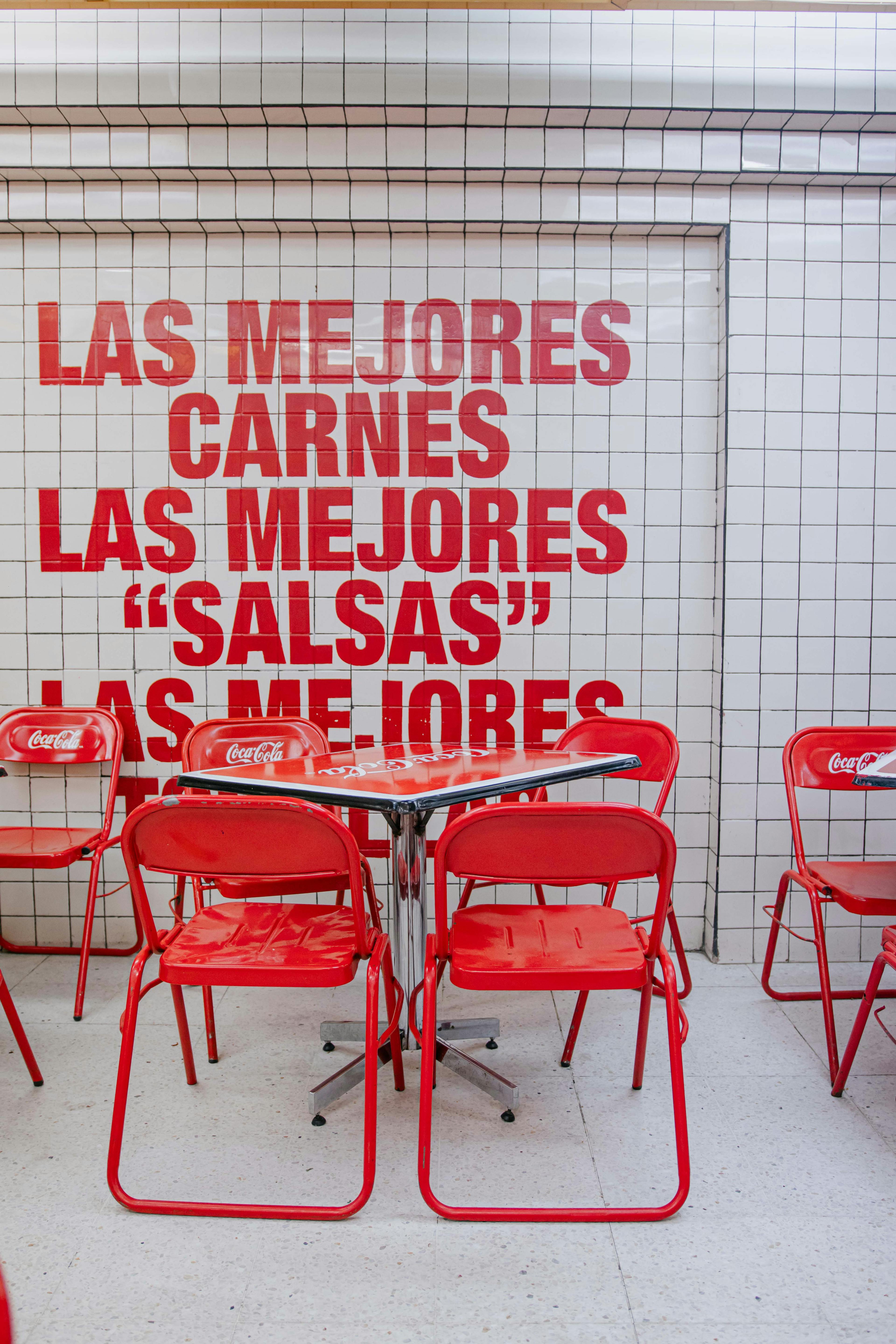
Food brands use very different colors than tech firms do. They want to grab your attention and spark your appetite. Bright red and sunny yellow are the most popular choices here. These colors make people feel hungry and very excited.
Red creates a sense of urgency in our human brains. It makes you want to stop and eat right now. Yellow adds a feeling of happiness and friendly warmth too. Together they create a fun mood for a quick meal.
Think about the famous red and yellow at Burger King. They use these colors to stand out on busy streets. This mix helps them sell more food to hungry drivers. It is a proven way to make a brand memorable.
Color choice can increase brand recognition by over eighty percent. This is why picking the right industry colors matters so much. You want people to remember your business after just one look. Good design builds trust and makes your content look authoritative.
Professional visuals help people understand your information much better. They keep readers engaged for a longer time on your page. Using a clear visual strategy helps you drive better results too. Well designed content always performs better than plain text alone.
How can you create professional designs with color?
Creating professional visuals does not have to feel scary. You can make your work look polished without a design degree. It often comes down to a few simple rules of balance. These steps help your content look clean and trustworthy for your readers.
When we pick colors, we want our message to be clear. A good design guides the eye to the most important parts. This makes your message easy to read and understand. Let's look at a classic method to balance your palette naturally.
Mastering the 60-30-10 rule
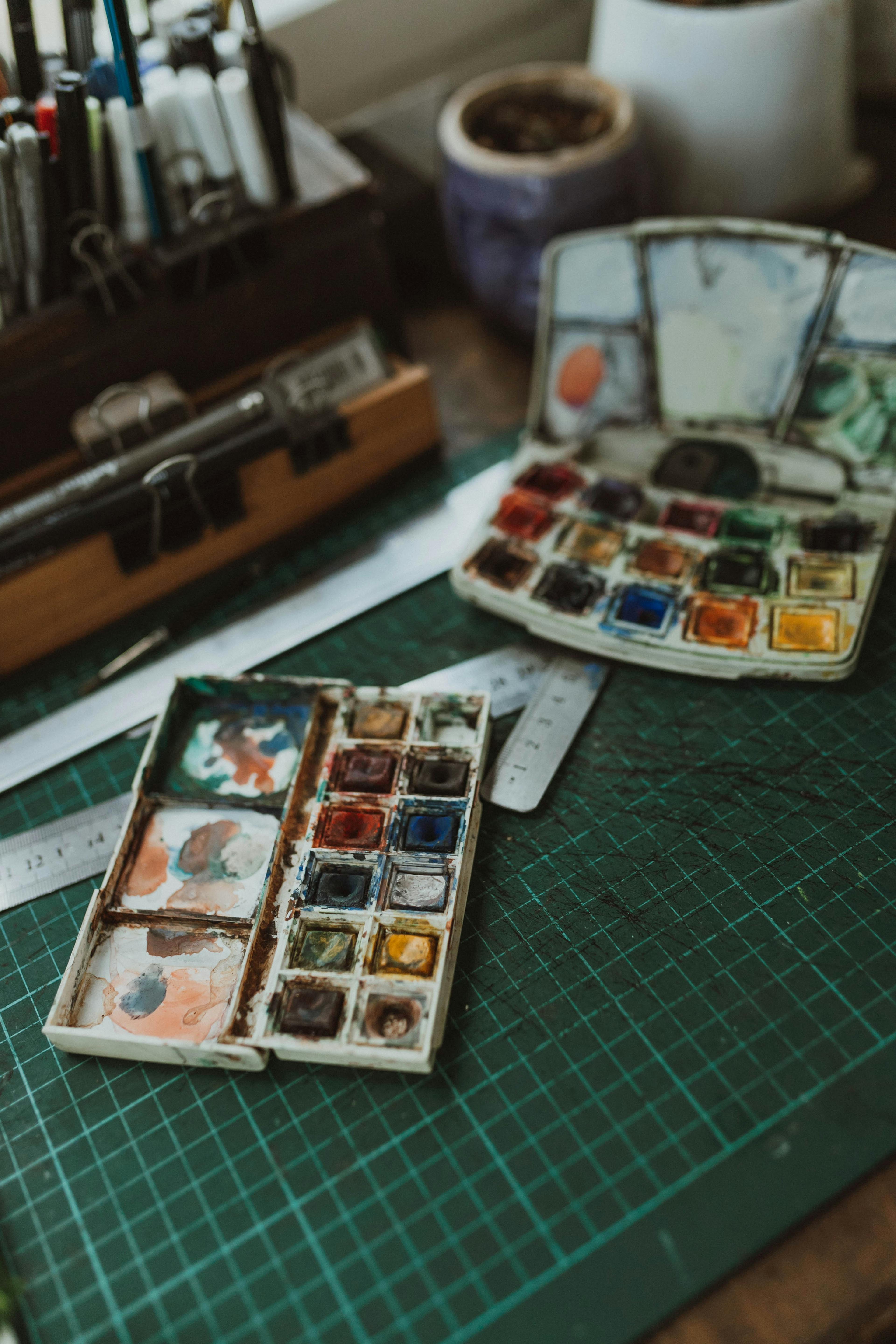
The 60-30-10 rule is a simple way to organize colors. You use 60 percent of a dominant color for the background. Then you use 30 percent of a secondary color. The last 10 percent is an accent color for small details.
This ratio creates a sense of harmony in your work. It keeps your design from looking messy or overwhelming. You can use tools like Adobe Color to find shades that fit this rule well. This helps you pick colors that stay in the same family.
A brand like Dropbox uses this rule very well. They use light blue for 60 percent of their main space. White covers 30 percent to keep things clean and light. The final 10 percent uses bright pink for their main buttons. This makes their website very easy to navigate and understand.
If you need more help, look at Smashing Magazine for layout ideas. They share many guides on how to use color for better balance. These tips help you keep your designs looking sharp and professional every time.
Some palettes are ready to use right away on sites like Color Hunt. These groups of colors already follow good design rules. They make it easy to choose a theme that feels right for your team. You just need to pick the one that matches your brand tone.
Ensuring high visual accessibility
Visual accessibility means everyone can read your content easily. This is very important for people with visual impairments. High contrast between text and background is the best way to help. It ensures your words do not get lost in the design.
You can check your color contrast with a tool like WebAIM. It shows you if your colors meet global standards for reading. This simple step makes your content much more inclusive for everyone. Good contrast helps tired eyes and those in bright sunlight too.
Microsoft uses inclusive design to reach many more people. They focus on clear contrast and very simple layouts. This helps people with low vision use their software tools. Their team found that accessibility helps everyone work faster and better. This approach increased their user satisfaction scores by a large amount.

You can find more advanced tips on Material.io from Google. They provide rules for how colors should look on different screens. These standards help you build trust with your audience through clear visuals. It shows you care about how people see your work.
Many busy teams now use Veeso AI to solve these challenges. This tool handles the color ratios and contrast for you automatically. You focus on your ideas while the tool creates polished visuals. It is a great way to save time and stay professional.
For more inspiration, you can read articles on Creative Bloq. They often share news about modern design trends and accessibility. Staying updated helps you keep your brand looking fresh and modern. It also gives you new ideas for your next project.
Learning the basics of accessibility is also easy on A List Apart. They offer deep dives into how design affects the user experience. This knowledge helps you make better choices for your marketing materials. You will feel more confident as you build your brand.
You can also visit the Interaction Design Foundation for more lessons. They explain the science behind how we see and process colors. Understanding these basics makes you a better communicator for your business. It turns simple images into powerful tools for growth.
The Nielsen Norman Group also provides great data on user reading habits. Their research shows that clear colors improve how people scan your pages. By following these tips, you make your content much more effective. This leads to better results for your whole team.
Lastly, remember that tools like Veeso AI can handle the hard work. They take your text and turn it into visual layouts in seconds. This allows you to produce high quality content without the stress of manual design. It is a smart choice for any growing marketing team.
Using these rules ensures your brand looks professional and welcoming. Balancing your colors and checking contrast makes a huge difference. Now that you know the basics, let's see how automation can help you even more.
Should you use AI to simplify design tasks?
Making visuals for your brand can feel like a heavy chore. Most small teams do not have a full-time designer on staff. This often leads to stress when deadlines get close for you. You might spend hours trying to make one slide look right.
You may worry that AI will make your work look robotic. However, many experts believe AI helps humans be more creative. Leading tech sites like Wired show how AI handles the boring parts. This allows you to focus on your actual ideas and stories.
Automating visual content creation
Content-first design tools are a real game changer for busy people. These tools start with your text instead of a blank page. They build a beautiful layout around your words in seconds. You no longer need to move small boxes around a screen.
A small marketing team used automated tools to create social posts. They spent five hours a week on design before the switch. Now they finish all their posts in just thirty minutes. This change allowed them to talk more with their online customers.
Many teams now use Veeso AI to bridge this gap. It turns your copywriting into clear visuals with one simple click. You do not need any special design skills to get results. The tool handles the layout so you can finish your work faster.

Research from experts at the MIT Technology Review supports this trend. They explain that smart tools reduce human error in repetitive tasks. Automation helps you stay productive while keeping your creative spark alive.
Maintaining brand consistency effortlessly
It is very hard to keep your brand looking the same. If your colors change slightly on every post, you look messy. AI tools help you keep your professional look without the extra work. Consistency builds deep trust with your target audience.
A recent study shows that consistent branding helps companies grow faster. According to data from Lucidpress, consistency can boost your revenue by 33 percent. This happens because customers learn to recognize and trust your specific look. You look like a big company even if you are small.
Tools like Veeso AI let you apply your color palettes instantly. You can update every page of a document at the same time. This ensures your slides and posts always match your brand perfectly. You never have to worry about using the wrong shade again.

You should check out sites like Product Hunt to see new tools. They list the best apps that help teams work smarter every day. Reading reviews on G2 can also help you find the right fit. These resources show you what other small businesses are using successfully.


