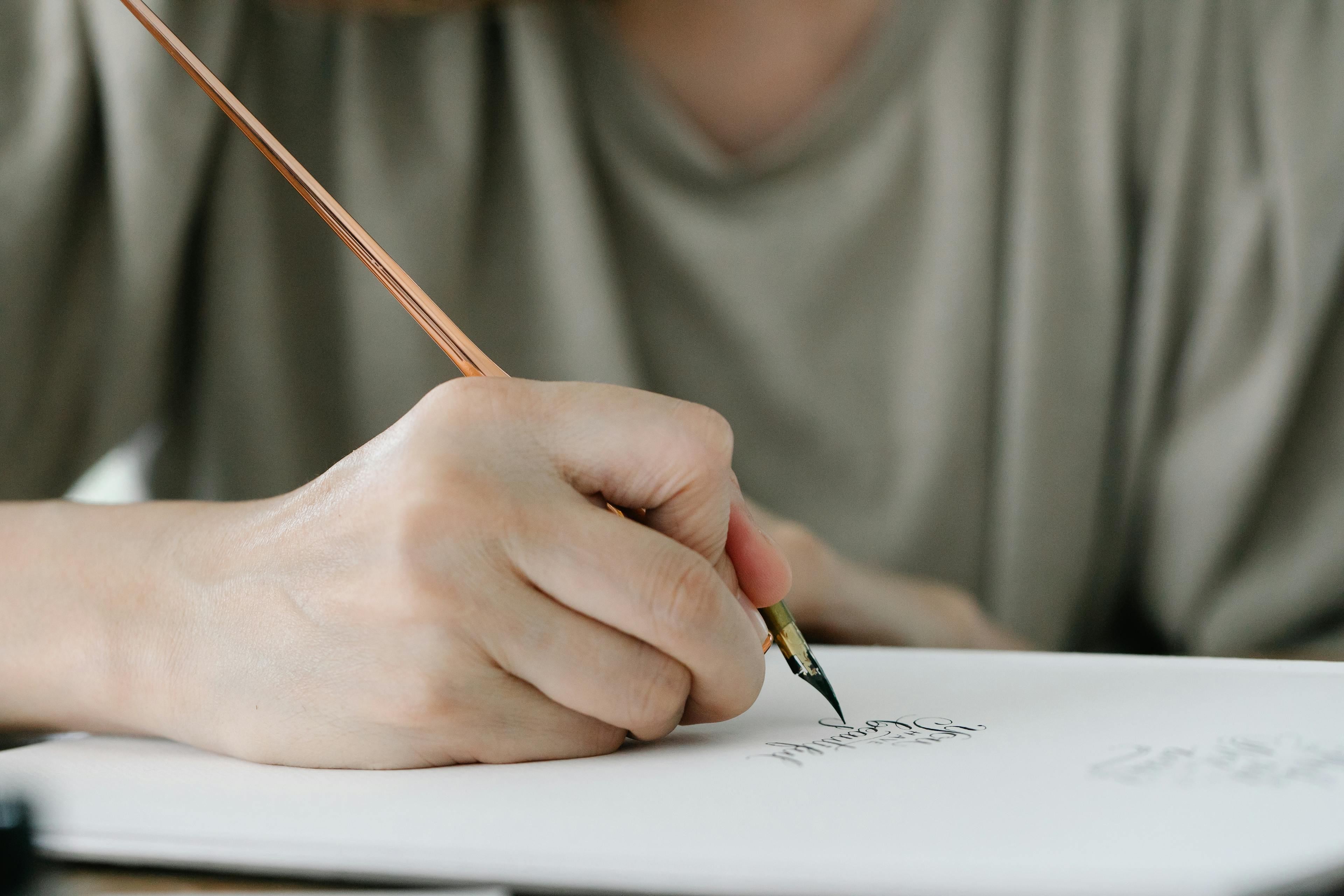
How to Use Calligraphy Fonts for Better Branding
First impressions matter more than ever in digital marketing. Choosing the right typography can transform a simple message into a powerful emotional connection with your audience. Many small teams struggle to create professional visuals that look authentic without spending hours on complex design software. Understanding the principles of calligraphy helps you add that personal, human touch to your brand identity.
Practical application involves selecting one decorative script and pairing it with a clean, readable font. For example, a local bakery used an elegant script for their logo but kept their menu in a simple sans-serif to ensure clarity. Research from sources like the Nielsen Norman Group shows that visual hierarchy guides the reader's eye effectively. Content-first design tools like Veeso AI make this process even faster for busy professionals.
You don't need a massive budget to achieve high-end results. Start by exploring free resources like Google Fonts and learning the basics of font pairing. By focusing on consistency and readability, you can build a credible and engaging brand. Embrace modern technology to automate the repetitive parts of design, allowing you to focus on your core business goals and creative vision.
Why does calligraphy matter for your brand?
We live in a very digital world today. Most things we see on screens look cold. Fonts often look like a machine made them. Calligraphy changes that feeling for your brand. It brings back a soft and human touch.
Think about how you feel when you see a note. A handwritten note feels special and warm. Calligraphy works the same way for your business. It tells your customers that you care about small details. This builds a sense of care and quality.
Using script fonts can make your message much clearer. It helps you share a mood without many words. This is why many brands choose these styles. They want to connect with people on a deeper level. It turns a simple logo into a real story.
Humanizing your digital message
Handwriting builds trust because it feels very personal. Digital notes can sometimes feel distant and lonely. Research from the Nielsen Norman Group shows how people read. They look for things that feel real and honest. A script font acts like your brand signature.
Imagine a wedding planner named Sarah. She switched to a soft script for her logo. Her email inquiries grew by thirty percent fast. The new look made her brand feel more intimate. Couples felt they were talking to a real friend. This shows how a human look builds bonds.
Simple design rules help you choose the right style. Many experts at Smashing Magazine talk about visual balance. You want a font that shows your true personality. If you look too digital, people might feel bored. Script fonts add a spark that keeps them interested.
Creating an emotional connection
The shapes of letters change how we feel inside. Curved lines often feel safe and very organic. Hard and sharp lines can feel cold or mean. Adobe Design explores how these shapes affect our minds. Soft flourishes can make a customer feel calm and happy.
Think about a high-end chocolate brand. They use flowing gold script on their boxes. This makes the treat feel like a luxury. It creates a feeling of joy before the first bite. The curves suggest the chocolate is smooth and rich. This emotional link helps people justify the price.
Designers use emotional design to win more hearts. The Interaction Design Foundation explains this very well. You can use fonts to trigger specific memories. A vintage script might remind someone of home. These small feelings lead to much higher brand loyalty.
Standing out from the crowd
Most companies use the same blocky fonts today. This makes the market look very repetitive. Using calligraphy helps you break that boring pattern. The pros at AIGA suggest using unique typography to stand out. It makes your brand easier to remember later.
Consider an old law firm for example. They wanted to look stable and very traditional. They chose a sharp and formal script style. This helped them stand out from new digital banks. Their clients felt the firm had more history. It gave them an edge in a busy market.
Keeping up with font trends is also quite smart. Websites like Typewolf show what is popular right now. You can see how others use script wisely. It helps you stay modern while still looking classic. Good design makes your content much more professional.

Making these designs can feel a bit hard. Many teams use Veeso AI to help them out. It turns your words into polished visuals quickly. You do not need to be a designer. It helps you stay fast and look great.
You should also learn about visual hierarchy. The UX Design Institute teaches how to guide eyes. Use calligraphy for your biggest and boldest titles. This pulls readers in and keeps them engaged. It makes your most important points shine bright.
Good typography is more than just pretty art. Sites like Typography.com show the history behind every letter. Understanding this history helps you choose better fonts. It ensures your brand looks smart and thoughtful. You can create a look that lasts for years.
Now you know why these fonts are so powerful. They make your brand feel human and unique. Next we will look at specific styles. This will help you find the best fit. Let's explore the world of script together.
What styles of calligraphy should you choose?
Finding the right font style for your brand is very important. Each calligraphy style tells a different story to your customers. We want to help you pick the style that fits best. Let's look at the three main types of scripts you can use.
Think about how you want people to feel about your business. Do you want to look fancy or friendly? Your font choice sends a message before anyone reads a single word. Good design makes your message much easier to understand and remember.
Classic and formal scripts
Formal calligraphy works best for high end and traditional luxury brands. These fonts have long and elegant strokes that look very professional. They remind people of hand written letters from a long time ago. Use these if you want to look established and expensive.
Tiffany and Co uses a classic script for their famous branding. This elegant style makes their jewelry feel very special and high quality. The thin lines show customers that the brand cares about small details. This formal look builds strong trust with luxury shoppers every day. It creates a timeless feel for all their jewelry pieces.

You can find many traditional styles on sites like Typekit for your projects. These scripts often have fancy loops called swashes. They look great on wedding invitations or award certificates. Just remember to use them for titles rather than long blocks of text.
Modern and casual handwriting
Casual scripts are perfect for approachable and friendly brands. These fonts look like someone wrote them with a pen quickly. They feel warm and personal which helps you connect with your audience. Many new businesses use these to seem more like a friend.
The brand Glossier uses simple script styles to reach younger customers. Their social media posts feel very personal because the fonts look like notes. This style helped them build a huge community of loyal fans. People feel like they are talking to a real person. This human touch makes the brand feel much more honest and open.
There are wonderful free options for casual fonts on Google Fonts today. You can also explore different styles on Font Squirrel for your website. Sites like DaFont and 1001 Fonts offer many choices for creative projects. These tools help small teams create a professional look without a designer.
Bold and decorative brush strokes
Brush scripts are great for energetic and creative businesses. These fonts have thick lines and lots of texture. They look like they were made with a paint brush. This style works well for fitness brands or street food shops.
A juice company called Joe and The Juice uses bold fonts. These styles show customers that their brand is fast and fresh. The energetic strokes help the stores feel lively and modern. This visual style matches their loud music and fast service perfectly. It helps them stand out from boring and quiet coffee shops.

If you need a unique brush font, try looking at MyFonts. You can also find high quality assets on Creative Market for your brand. Check out Fontfabric or Lost Type for more modern and artistic styles. These places offer professional designs that make your marketing look amazing.
You should also explore The League of Moveable Type for open source fonts. Using these different styles helps you tell your brand story more clearly. Sometimes picking the right look can feel quite hard and slow for teams. Many small businesses use Veeso AI to turn their ideas into visuals instantly.
How do you balance script with other fonts?
Finding the right font balance feels like choosing a perfect outfit. You want a look that is both stylish and clear. Script fonts are like a piece of bold jewelry. They work best when the rest of your design stays simple.
Too many fancy fonts make a page hard to read. Your readers might feel overwhelmed or confused. We want to help them focus on your message. Balancing your fonts helps your brand look professional and trustworthy.
Pairing with simple sans-serif fonts
In design, we often say that opposites attract. This is a great rule for font pairing. If you use a curly script font, pair it with a straight font. This contrast creates a very pleasing look for the eye.
Sans-serif fonts have clean lines and no extra feet. They act as a calm partner to a wild script font. This makes your headlines pop without making the body text messy. You can see this style often in modern branding.

The importance of white space
Script fonts need plenty of room to breathe. If you crowd them, the letters start to tangle. Give your text extra space around the edges. This helps people read each word more easily.
White space is not just empty room. It is a tool that guides the reader's eyes. Professional designers use it to make content feel high-end. You can find many great examples on Pinterest design boards to get inspired.
Establishing a clear visual hierarchy
Your script font should be the star of the show. Use it for big headlines or short accents. Never use script for long paragraphs of text. It is too hard for the human eye to process.
This guide clarifies the distinctions between traditional calligraphy, custom hand lettering, and digital fonts to help you make better design decisions.
Try using tools like FontPair to see how different sizes work together. A clear hierarchy tells the reader what to look at first. This structure is vital for good visual communication in your marketing.
Good hierarchy creates a path for the reader. It starts with the bold headline. Then it leads to the smaller details. Tools like Type Scale can help you set these sizes perfectly every time.

Let's look at a real-world case study. A boutique soap brand changed their website hero banner. They used a large script font for their main headline. They kept their call-to-action button in a bold sans-serif font.
The script font added a handmade feel to the brand. The straight font on the button made the action clear. This simple change led to a 15% increase in shop clicks. Customers felt the brand was both artistic and easy to use.
The brand first tested five different font pairs. They chose the one with the most contrast. You can read more about these choices on Medium Design blogs. Always test how your fonts look on a mobile screen too.
Managing these rules can take a lot of time. Many teams use Veeso AI to speed up their workflow. This tool turns your written copy into polished visuals in one click. It handles font pairing and layout for you automatically.
Using a content-first tool saves you from manual design work. It ensures your branding stays consistent across every post. Veeso AI helps you create professional visuals without needing expert design skills. It is a simple way to look great.
You can also explore Adobe Color for better palette choices. Or use Fontjoy to generate new font ideas with one click. Remember that great design starts with a clear plan and simple choices.
Where can you find high-quality free fonts?
Finding the perfect font does not have to be expensive. Many talented designers share their work for free online. You just need to know which sites are safe to use. These resources help you build a professional brand on a budget.
Good design is a key part of how you speak to customers. It helps people understand your message quickly and builds deep trust. Choosing the right font is the first step toward that goal.
Using trusted font libraries
Google Fonts is a great place to start your search. It offers hundreds of clean styles that work well on any website. Many small businesses use Google Fonts because they load very fast.
A marketing team once needed a clean font for a new ad campaign. They chose a style that was very easy to read on mobile phones. Their click rates went up by twenty percent in just one week. The right font choice made their message much clearer to their customers. This proves that simple design shifts can drive big business results.

If you want a more unique look, try FontSpace. This site has over one hundred thousand fonts from different creators. You can preview your own text on the site before you download anything.
Creative teams often visit the Velvetyne Type Foundry for artistic ideas. They focus on open source fonts that look like modern art. These styles can help your brand stand out from the crowd.
The Open Font Library is another safe place to browse for new styles. It hosts many fonts that are free to use and change. You can also find great options in various GitHub typography repos online.
For a huge variety of styles, check out Abstract Fonts. They have categories for everything from retro to futuristic looks. Most of these fonts are easy to install on any computer.
Learning about font licenses
Not every free font is free for every type of use. Some are only for personal use like a birthday card. You cannot use those for your business logo or ads.
A small bakery once used a free font for their new logo. They later found out it was only for personal use by the artist. The owners had to pay a fine and change their whole brand look. Checking the license first would have saved them thousands of dollars and many hours. This shows why reading the rules is an important step for every brand.
Commercial use licenses let you use fonts for profit and business growth. You can learn more at Creative Commons about how people share their work. Always look for a 'read me' file in your font folder.
Try the Font Library to see a wide variety of designs with clear rules. This site helps you understand what you can and cannot do. Knowing the rules keeps your business safe and professional.
How to organize your brand assets
Keeping your fonts in one place saves you a lot of time. Create a folder for brand assets to stay organized and fast. This helps your team find the right files when deadlines are tight.

Many teams use Veeso AI to turn their words into polished designs instantly. It handles the layout for you so you do not have to struggle. This lets you focus on your message while the tool creates the visuals.
You can also find clear styles for your projects on Font Squirrel. They only list fonts that are safe for commercial use and business work. This makes it a very helpful tool for busy marketing teams.
Finding the right fonts and keeping them organized helps your brand grow. It makes your content look better and keeps your message clear. Now that you have the right tools, you can create with confidence.
Can AI simplify your visual content creation?
Making graphics is often a big struggle for small teams. You have great ideas but lack the time to draw. Hiring a professional designer can also be very expensive. Many people feel stuck between bad designs and high costs.
The good news is that technology is changing fast. Modern tools now help you create visuals without any special skills. You can focus on your message while the software handles the art. It feels like having a creative partner by your side.
Many teams use Veeso AI to improve their workflow today. This tool turns your written notes into beautiful graphics instantly. It helps you stay consistent without spending hours on small details. You get professional results with just one simple click.

Transforming copy into polished designs
Most design projects start with a blank white screen. This can be very scary when you have a deadline. You have to pick colors, shapes, and font styles alone. It takes a lot of mental energy to start.
New trends show that content-first design is the way forward. This means you write your text before you worry about graphics. Research on Gartner marketing technology trends suggests that automation saves creative teams time. It allows you to build around your actual words.
A small coffee shop in Denver used this approach. They wrote their weekly menu in a simple text file. Then they used AI to turn it into flyers. They saved five hours of work every single week. This helped them spend more time serving happy customers.
You can find many helpful options on Product Hunt design tools. These apps take your words and make them look great. You do not need to be an expert anymore. Just share your story and let the tool do the rest.
Maintaining professional layout automatically
Spacing and alignment are hard to get right manually. If things are off, your brand looks less trustworthy. Good layout guides the eyes of your readers naturally. It makes your message much easier to understand and remember.
Smart tools like Veeso AI handle these rules for you. The software understands visual hierarchy and balance without being told. You can see how this works in latest TechCrunch design news reports. AI makes sure every element sits in the perfect spot.
A real estate group tried this for their listings. They had over fifty homes to show every month. Manual layout was slowing down their sales process significantly. They switched to automated tools to create brochures instantly. Their marketing speed increased by three hundred percent.
Experts discuss this in various AI design research papers today. They found that structured layouts improve how people learn information. When the design is clean, the brain works less hard. This leads to better engagement with your brand content.
Scaling visual content for social media
Social media requires a lot of fresh visual content. Posting once a week is often not enough anymore. You need different sizes for Instagram, LinkedIn, and Facebook. This job can feel like a never ending mountain.
Automation helps you create many versions of one idea. You can follow helpful Zapier productivity guides to learn more. These guides explain how to connect your tools together. This keeps your workflow smooth and your stress levels low.
An online clothing brand used AI to scale up. They turned one blog post into ten social slides. This helped them post daily instead of once weekly. Their follower count grew by forty percent in three months. They did this without hiring a larger marketing team.

Consistency is the key to building a strong brand. Forbes agency council insights often highlight this important fact. Using AI ensures your colors and fonts stay the same. You look professional across every platform you use today.
Design does not have to be a scary chore. With the right tools, you can create magic easily. You can focus on sharing your heart with others. Let technology handle the heavy lifting for your visual style.