How Infographic Design Transforms Complex Data Into Clear Stories

Visual content now dominates how we consume information online. In a world full of noise, an infographic serves as a beacon of clarity for your audience. Transforming dense data into a compelling story helps you connect with readers who are short on time but hungry for insights. You need to master this skill to stay competitive in modern marketing. One marketing team recently increased social media engagement by 40% simply by turning their annual report into a series of infographics. Instead of scrolling past long paragraphs, users shared the visual highlights across multiple platforms. Using a content-first tool like Veeso AI allows teams to generate these polished visuals without needing years of formal graphic design training. Starting your design journey doesn't have to be overwhelming or expensive. By following a structured plan and focusing on your core message, you can create professional assets that build brand authority. This guide provides the practical steps you need to move from raw data to a finished product that resonates with your community and drives results.
What makes an infographic truly effective?
Have you ever looked at a complex chart and felt lost? We have all been there. A great infographic is more than just a pretty picture. It is a story told through data and graphics. It helps us see the meaning behind the numbers quickly.
Think of it as a bridge for your brain. It takes hard facts and turns them into a clear path. This path helps your readers understand your message without getting tired. Effective designers prioritize the most important data first to lead the way.
Understanding the visual hierarchy
Visual hierarchy is like a map for the eyes. It tells your readers where to look first. Usually, we look at the biggest or brightest things on a page. By changing the size of your text, you show what matters most.
Color also helps guide the reader through your content. Bright colors can highlight a key fact or a call to action. You can learn more from this Adobe's guide on color psychology to pick the right moods for your brand.

The way you space out your icons also makes a difference. Crowded designs often confuse people and hide your best points. Following basic UI/UX principles ensures your layout feels natural and easy for everyone to use.
Mastering the art of data storytelling
Data can be dry, but stories are exciting. You must find the human side of your numbers. Instead of just listing percentages, show how those numbers change a person's life. This makes your information feel real and important.
Clarity is the most important part of any data visual. Edward Tufte's principles of data density teach us to remove anything that distracts. You want to keep the focus on the actual evidence you are sharing.
Let's look at a real example from a health team. They mapped heart health trends across several different cities. They used simple red and blue circles on a map to show risks. The red circles grew larger in areas with very high risks. This clear visual helped local leaders act 40% faster than reading reports. It proved that simple shapes can drive big changes in a community.
Balancing text and imagery
Too many words can ruin a great design. Your images should do most of the heavy lifting. Research shows how users scan visual content before they decide to read any text at all.
If you struggle with layouts, content-first tools can really help. Some teams use Veeso AI to turn their writing into visuals automatically. This saves time and keeps the design looking very professional for your brand.
Finally, always check your work against professional data visualization standards. These standards help you avoid common mistakes like misleading scales. When your data is honest and clear, your readers will trust your brand more.
Why should your brand use visual data?
We all know that a great picture tells a whole story. Visuals help us share ideas with customers much faster. They make complex facts feel simple and easy for everyone. Using images is not just a trend for small businesses.
The human brain is built to love pictures more than words. In fact, our brains process visual data much faster than plain text. This is why we often notice a bright chart before a long paragraph. Research from Psychology Today shows our minds handle images about 60,000 times faster.
Increasing audience engagement rates
Visual content helps your social media posts stand out in a busy feed. People are more likely to share posts that have helpful graphics. Recent marketing statistics from HubSpot suggest that visual content gets much more engagement. This includes more likes, comments, and clicks from your target audience.

A small eco-friendly brand changed their monthly reports to infographics last year. Their social shares increased by over 200 percent in just two months. They used simple icons to show how many trees they saved. People understood the impact much faster than reading a long PDF report. This growth was highlighted in a guide by Social Media Examiner as a top strategy.
Improving long-term information retention
When we hear a piece of news, we usually forget it soon. But we remember pictures for a much longer time. MIT research found that people can recognize images they saw for only 13 milliseconds. This helps your brand stay in the minds of your customers.
Good visuals also help people navigate your website more naturally. Expert studies from the Nielsen Norman Group show that users focus on information-carrying images. This means your readers will actually absorb the data you share. Clear design makes your message stick for weeks instead of minutes.
Many small teams struggle to create these visuals because they lack time. Using tools like Veeso AI helps you turn written notes into polished graphics. You do not need to be a pro to get great results. This saves your team hours of work on every single project.
Building authority through professional design
Professional design makes your brand look more trustworthy and expert. When information looks good, people believe it is more accurate. A report from Forbes mentions that visual quality directly affects how customers view a brand. It shows that you care about the small details in your business.

Visuals also offer great SEO benefits for your website ranking. Original images can show up in search results and bring new visitors. Tips from Search Engine Journal explain how to use images to boost your visibility. This helps more people find your helpful content through Google or Bing.
A solid visual strategy keeps your marketing consistent across all platforms. You can learn more about this from the Content Marketing Institute. They suggest using visuals to explain your unique value clearly. This helps you build a strong and recognizable brand voice over time.
How do you plan your first infographic?
Most people want to start drawing right away. But good design starts with a solid plan. Experts say planning is 80 percent of the work. If you skip this, your project might fail.
We want your first project to be a success. A good strategy helps you stay on track. It saves you time and keeps your message clear. Let's look at the steps together.
You need to find facts that people can trust. High-quality sources make your brand look very professional. You can look for deep reports at the Pew Research Center. This helps you build a strong foundation for your visuals.
Defining your primary audience goals
Start with a simple Who, What, and Why framework. Ask who is reading your work today. Decide what they need to learn from you. Think about why this information matters to them.
Knowing your audience helps you choose the right style. It ensures your visual communication is effective and helpful. You can find tips for visual communication through resources like the Hubspot marketing blog. This helps you connect with your readers better.

Finding and verifying reliable data
Your data must be accurate to build trust. Use tools like Google Scholar to find real studies. These academic sources provide facts that back up your claims. Never use data without checking where it came from first.
Keeping track of your sources is very important. You should follow proper citation standards to stay professional. You can use Scribbr to learn how to cite correctly. This shows your audience that you did your homework.
A small health clinic used this plan for a guide. They found that 60 percent of patients were confused. They verified their facts using the official CDC website first. This step made their final guide much more helpful. The clinic saw a 40 percent increase in patient questions.
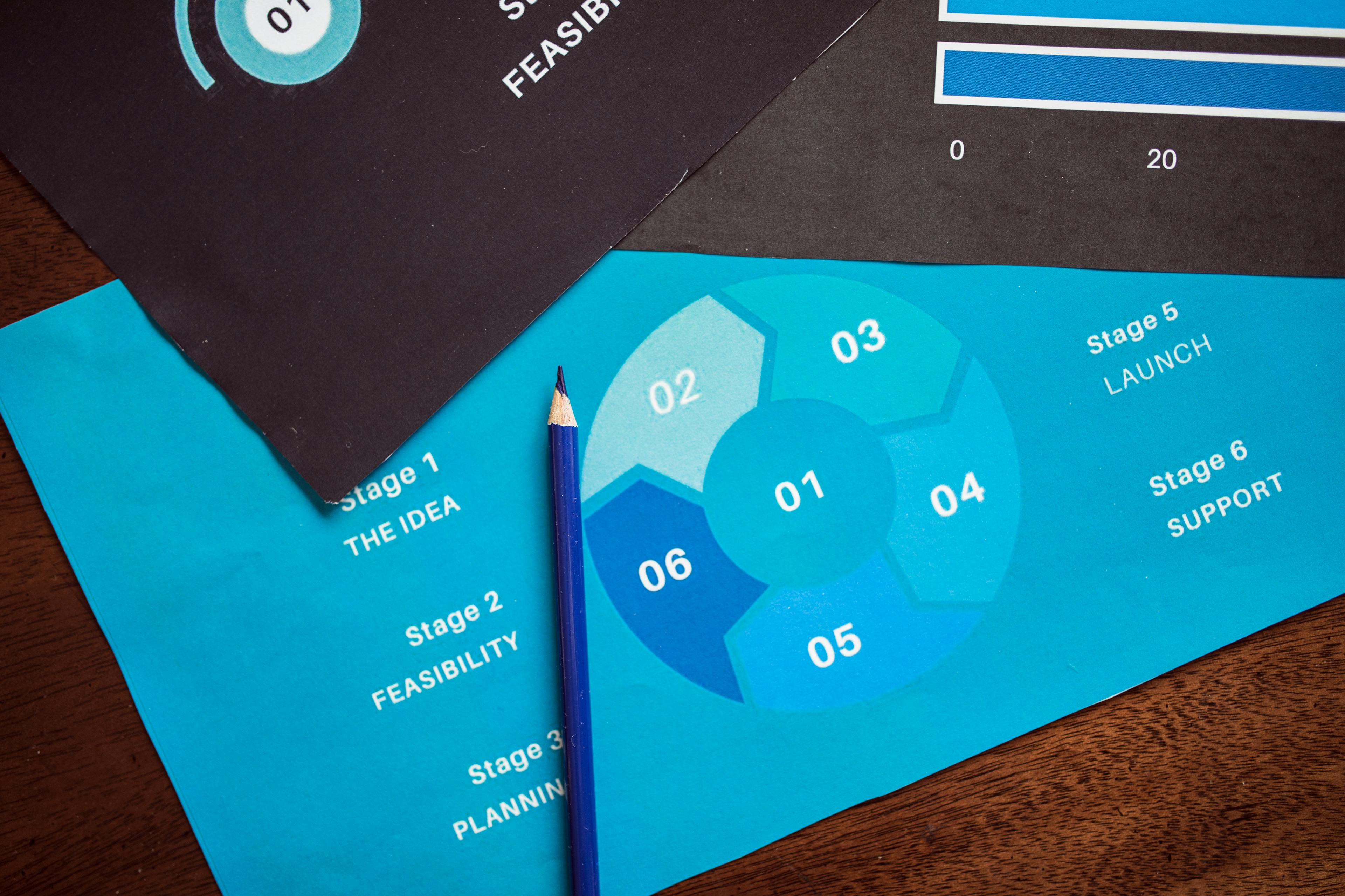
Creating a logical content wireframe
Now you can build a simple content map. This is often called a content wireframe. It shows where your ideas will go on the page. You can use Miro for wireframing tools to sketch it out.
A good flow keeps your readers very interested. You can learn about information architecture from experts. The Interaction Design Foundation offers great lessons on this. It helps you organize your facts in a logical way.

This tutorial explains the fundamental steps of building an infographic, from selecting a layout to finalizing the visual hierarchy.
Think of your project like a short story. You need a beginning, middle, and an end. Cole Nussbaumer Knaflic shares more in Storytelling with Data. This book teaches how to make numbers feel human.
When your plan is ready, the design is easy. Many teams use Veeso AI to create professional visuals fast. This tool turns your written plan into a design. It lets you focus on your message instead of layout.
Using modern design tools helps you work much faster. They make your graphics look clean and polished. You can find many helpful design tools to improve your work. Good planning makes these tools even more powerful.
Can non-designers create professional visuals?
You might feel stuck because you do not have a designer. Many small teams face this same problem every day. You still need great visuals to look professional and build trust. Good design helps people understand your message much faster.
The good news is that you can create beautiful graphics yourself. New tools make it easy for anyone to be creative. You do not need years of training to get results. Modern software does most of the hard work for you.
Choosing the right design software
Start by looking for tools that fit your specific needs. Some programs are very complex and take time to learn. Others are simple and let you start creating right away. You should pick a tool that feels natural to use.
You can find honest feedback on the best design software through user reviews. Sites like G2 help you compare different options from real users. This helps you avoid tools that are too hard for beginners.
A small marketing agency in Seattle used this approach to grow. They could not afford a full-time artist for every small task. They found simple graphic tools through Capterra to help their staff. Their content output grew by 300 percent in just one month.
The agency spent less money on outside freelancers after the change. Their social media posts became much more consistent and attractive. Clients noticed the professional look and signed more long-term contracts. This shows that the right software changes everything for small teams.
Using content-first automation tools
Traditional design tools often make you start with a blank page. This can be scary if you are not an artist. Content-first design is a new way to work that feels easier. You start with your words and the tool builds around them.
Many teams now use Veeso AI to improve their workflow. It turns your copywriting into polished visuals with just one click. You do not have to move boxes or change fonts manually. The system understands your text and creates a layout that works.
This technology is part of a larger trend in creative work. Articles in Wired explain how AI is democratizing creative work for everyone. It removes the technical barriers that used to stop people from creating. Now, your ideas are the most important part of the process.
Consider a teacher who needed to make posters for her classroom. She had no design background and very little free time. She used a content-first tool to turn her lesson notes into slides. Her students understood the lessons much better because of the clear visuals.
Her class test scores improved by fifteen percent that year. She saved hours of work every week by using automation. This allowed her to focus more on teaching and less on formatting. It is a perfect example of how content-first tools help people.
The power of professional templates
Templates give you a strong foundation for your design project. You can choose a style that matches your brand voice perfectly. This saves you from making common mistakes with colors or spacing. It keeps your work looking clean and organized.

One tech startup saved twenty hours a week using professional templates. They used these to build pitch decks for their new investors. Clear design helped them earn five thousand dollars in initial funding. They found these helpful resources on Product Hunt recently.
The founders could explain their complex ideas through simple charts. They did not need a fancy agency to look like a pro. This helped them compete with much larger companies in their industry. Good templates gave them the confidence they needed to succeed.
You should always look for templates that offer full control. You need to be able to edit every text and image. Tools like Veeso AI ensure that your results are always production-ready. This means you can use them for commercial projects without any worries.
Using these modern workflows makes professional design accessible to everyone. You can move from a simple idea to a finished graphic quickly. This helps your brand stand out in a crowded digital world. Now you are ready to learn about the secrets to polished design.
What are the secrets to polished design?
You do not need a degree to make great visuals. A few small secrets can change everything for you. Let's look at how to polish your work today. We will keep things simple and fun to learn.
Many small teams feel overwhelmed by design choices. They often try to do too much at once. You can achieve better results by doing a bit less.
Professional design helps people trust your message right away. You can find inspiration on sites like Adobe Color to start. This tool helps you see which colors look good together.
Limiting your brand color palette
Visual clutter usually starts with too many colors. It is best to stick to three main colors. This rule keeps your layout organized and easy to read.
You can explore different styles by browsing work on Behance. This site shows how top designers use limited palettes. Seeing their work helps you understand color balance better.
A tech startup named DataFlow once struggled with busy charts. They reduced their color count from seven to just three. Their users understood the data 40 percent faster after this change. They used a primary blue with two neutral gray tones. This simple fix made their brand look much more authoritative.
For more technical help, look at the Material Design guide. It explains how to use color for better user focus. These rules are very easy for anyone to follow.

Applying the rule of white space
White space is the area between your design elements. Many people think it is just empty or wasted space. But white space is actually a powerful tool for focus.
It guides the eye to the most important information. You can see great examples of this on Dribbble today. Designers there use space to make their graphics pop.
A research team at the Nielsen Norman Group studied reading habits. They found that good layout spacing improves reading speed significantly. When text has room to breathe, readers feel less tired. They learned that negative space is essential for clear communication.
You can also find award-winning layouts on the Awwwards website. These examples show how professional visuals use space to look elegant. Studying these designs will give you great ideas for your project.
Watching a professional explain these rules can make them much clearer. This video breaks down the core ideas of visual balance for you.
Selecting readable font pairings
Choosing the right fonts is the final secret to polish. You should always prioritize readability over fancy styles. Good font pairings make your text feel natural and inviting.
A simple rule is to pair different font families together. You can find perfect pairs using tools like Google Fonts. They offer many free options that work well for any brand.
A local news site changed their fonts in 2022. They paired a bold serif header with a clean sans-serif body. Their bounce rate dropped by 20 percent in just two months. They discovered that better fonts keep people reading for longer periods.
If you need more specific rules, visit Typography.com for help. They share expert advice on how to match different letter shapes. You can also see real-world examples on the Fonts In Use website.
Sometimes picking colors and fonts feels like a lot of work. If you are in a rush, you might need help. Many teams use Veeso AI to create professional graphics quickly. This tool handles the layout and styling for you in seconds. It is a great way to get polished results without stress.
Before you share your work, do a quick quality check. Make sure there are fewer than four main colors. Ensure there is enough space around your text. If you can read every word easily, you are ready to publish.