Mastering Color Palettes for Professional Brand Designs
Choosing the right colors defines your brand's impact and message. Most small business owners struggle to create professional visuals because they lack traditional design training. This guide simplifies color theory, helping you pick beautiful combinations that resonate with your audience and build lasting trust. Professional design enhances communication and makes your content far more memorable to viewers.
Many successful marketing teams use content-first design tools to skip the tedious manual layout process. For example, a local cafe transformed its menu from a plain document into a vibrant visual asset in minutes. Using high-quality hex codes ensures consistency across all platforms. You can find inspiration from resources like Adobe Color or study color psychology research from authoritative academic journals.
Start your design journey today by experimenting with modern palettes and efficient tools. Implementing the right color strategy saves time and improves your conversion rates significantly. Professionals often recommend Veeso AI for its ability to turn text into polished designs instantly. Download our color guide and use the provided hex codes to upgrade your brand's visual identity immediately.
Why does color matter in visual storytelling?
Have you ever noticed how a color makes you feel? Maybe a bright red makes you feel excited or alert. This is not just by chance. Colors tell a story before we even read a single word.
Colors act like a secret language for our brains. They help us understand what a brand wants to say instantly. Choosing the right shades helps your message reach the right people quickly.
Creating an immediate emotional connection
Specific colors trigger deep psychological responses in our minds. For example, blue often creates a sense of calm and safety. Many banks use blue to show they are stable and reliable.
Warm colors like orange can make people feel hungry or happy. This is why many restaurants use orange and yellow in their logos. These colors invite us in and make us feel welcome.
The way your brain sees color affects how you think and feel. Studies show that colors can even change your physical state. For instance, red can actually increase your heart rate and energy.

Let’s look at a famous case study from a company called Performable. They wanted to see if button color changed user actions on their site. They compared a green button with a red one.
Most people thought green would win because it means go. Surprisingly, the red button increased clicks by 21 percent. This simple color change led to much higher conversion rates for them.
This shows that color is about more than just looking pretty. It is a powerful tool to drive action. You can use color to guide your readers exactly where you want them.
Building brand recognition and trust
Using consistent colors makes your business look professional and organized. People start to associate those specific shades with your brand name. This build-up of memory creates long-term trust.
Research found that people judge a product within 90 seconds. Up to 90 percent of that judgment is based on color alone. First impressions happen fast, so your palette choice matters a lot.
Small teams often struggle to stay consistent with their designs. Using Veeso AI helps you create polished visuals that match your brand perfectly. It turns your copy into professional designs quickly.
Enhancing readability for better communication
Professional design makes your information much easier to digest. Good color contrast ensures that your text stands out from the background. This helps your audience read your content without any strain.
Poor color choices can hide your most important points. If the text is hard to see, people will simply stop reading. Clear visuals help you keep your reader engaged for a longer time.

Visual hierarchy tells the eye what to look at first. By using a bold color for headings, you guide the reader's path. This structure makes complex ideas feel simple and easy to follow.
When your content looks professional, people trust your message more. Tools like Veeso AI make it easy for anyone to produce high-quality work. You don't need years of design school to look great.
Understanding these basics is the first step toward better stories. Now that you know why colors matter, you can start picking your own. Next, we will learn how to choose the right palette.
How do you choose the right palette?
Picking colors for your project can feel like magic at first. It is actually a simple process that anyone can learn quickly. You do not need a design degree to get it right. I want to help you find a mix that feels natural. We will look at a few easy steps to start.
Great design starts with a clear plan for your brand identity. Colors tell a story before your audience reads a single word. They create a mood and build trust with your customers. Using the right tones makes your message much easier to understand. This is why professional design is so valuable for small teams.

Finding inspiration in the natural world
Nature is the best teacher when it comes to color. Think about the soft blues of a morning sky. Or consider the deep greens of a quiet forest path. These combinations always feel balanced and pleasing to our eyes. You can find beautiful ideas just by looking outside your window.
Look at the brand Outdoor Voices for a great example. They chose earthy colors like forest green and navy blue. This helped them stand out from neon athletic brands. The company saw sales grow to $40 million by 2018. Their choice made the brand feel more human and approachable.
You can take a photo of a place you love. Use a tool to pull colors directly from that image. This ensures your palette feels organic and grounded. It is a wonderful way to create a mood that feels real. Many designers use this trick to start their creative process.
If you need a quick start, try using Coolors. It lets you generate palettes based on images or trends. You can lock colors you like and swap others out. This helps you explore many options in just a few minutes. It is a very friendly tool for beginners.
Applying the 60-30-10 design rule
The 60-30-10 rule is a classic secret for perfect balance. Use your main color for 60% of the design. This is usually a neutral or calm background tone. Then, use a secondary color for 30% of the space. Finally, use a bold accent color for the last 10%.
This math keeps your visuals from looking messy or loud. It guides the eye to the most important information first. Professional designers use this system to create a clear visual hierarchy. You can see this rule in action on most modern websites. It makes every slide or post look very polished.

Tools like Adobe Color can help you find these perfect ratios. You can explore different color harmonies like complementary or analogous. The tool shows you exactly how the colors work together. It is a great way to learn color theory while you work. You will feel more confident in your choices quickly.
If you want curated ideas, browse through Color Hunt. It is a free library of thousands of trendy palettes. People vote on their favorite mixes every single day. This shows you what styles are popular right now. It is a fast way to get inspired for your next project.
Matching palettes to your brand personality
Your colors should always reflect who you are as a business. A financial company might choose stable blues and greys. A creative agency might use bright yellows or oranges. Think about how you want your customers to feel. Veeso AI can then help you apply these colors to your content instantly.
Remember to keep your text easy to read for everyone. Slack redesigned its sidebar to make it more accessible. They chose a brighter aubergine color to improve readability. This change helped millions of users see information more clearly. It shows that caring about your users is a smart move.
You should always test your color contrast before you finish. Use a tool like the WebAIM contrast checker. It tells you if your text is clear enough for all readers. This is a vital step for inclusive and professional design. It ensures your message reaches every person in your audience.
Color psychology is a powerful tool for building connections. Different shades can trigger specific emotions in your readers. For example, blue often feels trustworthy and calm. Red can create a sense of excitement or urgency. Learn more about these meanings from experts at HubSpot.
Choosing the right palette takes a little practice and patience. But with these steps, you are ready to create something beautiful. Once you have your colors, you can start applying them everywhere. Next, we will look at the hottest color trends for modern businesses.
What are trending combinations for modern business?
Choosing the right colors for your business can feel very hard. Trends move fast in the digital world. You want to look fresh but also professional for your clients.
Modern brands now focus on specific moods rather than just bright colors. We see teams moving toward palettes that tell a deeper story. This helps people connect with your brand on a personal level.
Industry experts often share new ideas for layouts and styles. Many designers look at Behance design trends to see what is popular right now. This helps them stay ahead in a crowded market.
Professional neutrals for corporate reliability
Traditional businesses usually stick to colors that feel safe and stable. Navy blue and charcoal gray are perfect for building trust with customers. These colors show that your company is established and serious.
You can use a palette like #1B263B (Deep Navy), #415A77 (Steel), and #E0E1DD (Pearl). These shades work very well for B2B presentations and formal reports. They keep the focus on your data without distracting the reader.
Consider how a bank like J.P. Morgan uses deep blue tones. They want to look secure so people trust them with money. This choice helps them appear more authoritative than a bright startup. Their design choices follow established branding colors to keep a steady image.

High-energy vibrants for social media engagement
Learn a step-by-step professional process for selecting colors that align with your brand identity and message.
Social media is a very noisy place for most brands. You need high-contrast colors to stop people from scrolling past your posts. Bright pinks and electric blues work very well for these fast platforms.
A popular mix is #FF006E (Electric Rose), #8338EC (Vivid Violet), and #FFBE0B (Amber). These colors pop on small smartphone screens and grab attention instantly. Dribbble color inspiration shows many creators using these bright combinations today.
Look at how Discord uses its signature blurple color. This bright mix of blue and purple feels friendly and energetic for gamers. It helps them stand out from boring gray office tools. Their bold style helps improve social media visuals and keeps younger users engaged.
Earthy tones for sustainable brands
Sustainable brands often choose colors that remind people of the forest. Deep greens and warm browns feel very organic and honest to customers. This style is perfect for eco-friendly products or health services.
Try a combination like #283618 (Forest Green), #606C38 (Sage), and #DDA15E (Wheat). These colors make a brand feel grounded and very kind to nature. You can see more color palette tips on how to balance these tones effectively.
Oatly uses a muted cream and brown palette for their packaging. It looks like recycled paper which fits their message about the planet. This simple design makes their oat milk feel more natural than competitors. Using these tones helps build brand credibility with people who care about the environment.

Why tech companies love blue and purple
Many software companies use shades of blue because it feels safe. Blue suggests that a company can handle your personal data carefully. It is the most popular color for technology brands around the world.
Purple is also growing in popularity for creative tech tools. It feels more modern and innovative than traditional blue colors. Many teams use Veeso AI to apply these modern colors to their documents instantly.
There is a deep connection between color psychology and how we feel. Blue makes us feel calm while purple sparks our imagination. Understanding these feelings helps you choose the best colors for your next big project.
Seeing these colors in action can help you decide which one fits. This video explains how the best brands choose their colors for the modern web.
Recent design statistics show that consistent color use increases brand recognition. When your visuals match your message, people remember your company much better. This is why choosing a trending but timeless palette is so important.
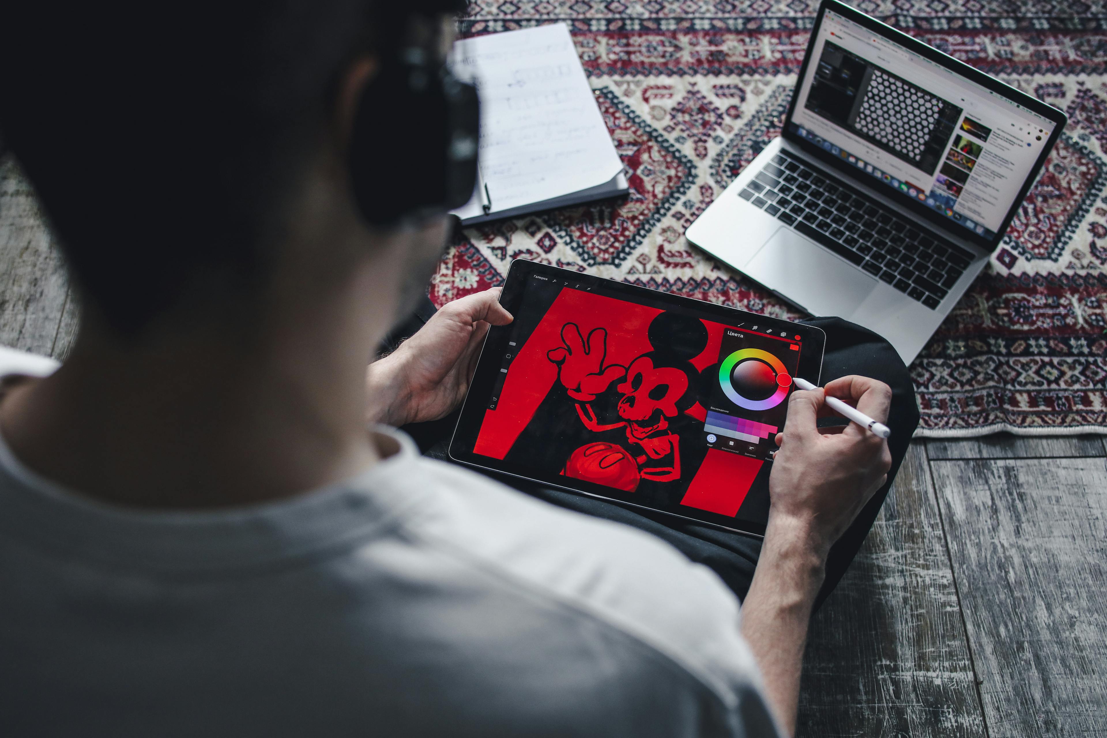
Can content-first tools simplify your workflow?
Creating professional visuals often feels like a giant hurdle. You likely have great ideas but lack the design skills to show them. Many teams spend hours fighting with complex software just to make one slide.
This struggle wastes valuable time that you could spend on strategy. We need a way to move faster without losing quality. Content-first tools offer a fresh path for busy teams with tight deadlines.
Moving beyond traditional template limitations
Traditional templates often feel like a cage for your words. You find a pretty layout but your text is too long. The boxes do not move and the design breaks easily. This forces you to shrink your font until no one can read it.
Research by the Nielsen Norman Group shows how users read in an F-shaped pattern. If your layout is messy, people will miss your message. Fixed templates often hide your most important points because of rigid boxes.
A small social media agency tried to use basic templates for five clients. They spent six hours every day just resizing text boxes. They switched to a more flexible visual marketing strategy to save time. This change helped them finish their work twice as fast.

Automating layout while maintaining full control
Modern tools now handle the layout work for you automatically. You simply provide the text and the tool builds the design. This content-first design approach ensures your message always fits perfectly on the screen.
Many busy teams now use Veeso AI to solve this problem. It turns your copywriting into polished graphics with just one click. You do not have to move any boxes by hand anymore. This tool gives you professional visuals without the usual stress.
One marketing manager had to create three different slide decks in one afternoon. She used a tool with an automated layout to speed up her work. She saved four hours of manual clicking and dragging. Her team loved the clean and structured results she produced.
Transforming documents into visual assets
Long documents often sit in folders where no one reads them. You can now turn these files into engaging visual content easily. This helps your audience understand complex data in a much shorter time.
A high school teacher had thirty pages of dense history notes. She needed to make slides but had very little free time. She used Veeso AI to scan her Word document and build slides. This helped her students learn better through clear visual aids.
Reports from Microsoft suggest that visual aids can improve learning by a large margin. The teacher mentioned above spent her saved time helping her students. She no longer felt exhausted by her weekly prep work. She found that professional design made her lessons much more exciting.
Small businesses often face many marketing challenges due to low resources. Using smart tools allows them to compete with much larger companies. You can create a high-quality brand image without a huge budget or staff.

Where should you apply your new palettes?
You have finally picked the perfect set of colors for your brand. Now you need to use them in the right places. Using your palette correctly makes your work look very professional.
Consistency is the secret to building trust with your audience. When your colors match everywhere, people remember your brand much better. It shows that you care about every small detail.
Think about your favorite brands and how they use color. They use the same shades on their website and social media. This helps create a unified feel for their entire business.
Polishing high-impact social media carousels
Social media is a very visual place to share your ideas. Carousels are great because they let you tell a longer story. Your colors should guide the reader through every single slide.
Use your main brand color for the background of your first slide. This catches the eye as people scroll through their feed. Use your accent colors for important tips or big quotes.
A small fitness coach changed her carousel design last year. She used a bright orange color for her call to action buttons. Her engagement rate grew by 25 percent in just two months. She kept the background a soft white to make the orange pop. This simple change helped her followers know exactly where to click.

You can find many great tips on the Content Marketing Institute website. They explain how visual consistency helps keep your audience engaged for longer. It is a smart way to grow your brand.
Creating professional and cohesive presentations
Presentations often feel dry and boring to the audience. You can change this by using your palette across all slides. Good design helps people understand your data much faster than text.
If you have long Word files, Veeso AI can help you. It turns your written content into polished visuals with one click. This tool keeps your colors consistent through the whole document transformation.
An education startup had to turn a 50 page manual into slides. They used professional visuals to highlight the most important parts of the lesson. Student test scores improved by 15 percent because the info was clearer. They used a calm blue palette to help the students focus. This made the learning process much more enjoyable for everyone involved.
Many teams use Veeso AI to save time on design tasks. It allows you to focus on your message instead of manual layouts. Your presentations will look like a pro made them every time.
Designing high-converting product landing pages
Your landing page is where visitors decide to trust you. Using a cohesive palette makes your site look safe and reliable. This leads to more sales and happy customers for your business.
Use your strongest accent color for your buy buttons. This guides the eye to the most important part of the page. You want the button to stand out from the background colors.
A skin care brand tested two different button colors last month. Their original button was a dark grey that blended in too much. They switched it to a vibrant coral from their new palette. Clicks on the button increased by 20 percent almost overnight. This proves that the right color can drive real action from your users.

You can learn more about web design standards from Orbit Media. They share great data on how professional design improves your results. It is helpful for any small business owner to read.
Applying your colors across all touchpoints is a big step. It makes your brand feel complete and very strong. You are now ready to show your beautiful work to the world.