Presentation Slide Content Density Guide
Learn exactly how much text, data, and visuals belong on each slide so your audience follows every point. Apply research-backed rules for word count, bullet limits, and white space. Walk away with a repeatable format that keeps any deck clear from slide one to the last.
Three Ways to Generate slide deck visual layouts
Describe Your Deck's Purpose and Let AI Set the Density
Tell the tool what your presentation is for, who the audience is, and how you plan to deliver it. The AI uses that context to generate slide layouts with an appropriate content balance built in from the start. You get a structured visual framework that reflects the right information density for your specific scenario, not a generic template you have to strip back.
- Prompt by delivery context: live keynote, async send, or printed leave-behind
- AI distributes content across slides to respect the one-idea-per-slide rule
- Generates visual hierarchy so primary claims stay dominant over supporting detail
- Output is fully editable: adjust text, swap visuals, or restructure any slide
Start From a Slide Density Template That Matches Your Format
Pick a starting layout built around a specific content format: minimal single-claim slides, balanced structured decks, or reference-dense pages for self-contained reading. Each template is designed with a deliberate text-to-visual ratio so you're not guessing at white space or bullet point density. Customize the text, data, and visuals to fit your actual content.
- Templates organized by density format: minimal, balanced, and reference-dense
- Pre-set slide hierarchy with clear heading, body, and evidence zones
- Adjustable white space and element count per slide
- Export as high-resolution PDF or PNG for print or screen delivery
Import Your Existing Content and Restructure It Into Readable Slides
If you've already written your presentation in a Word doc, PDF, or Markdown file, you don't need to rebuild it from scratch. Import the content and the tool restructures it into designed slide pages with appropriate density, visual pacing, and layout hierarchy. This is especially useful when you're working with content-heavy material that needs to be broken into digestible, single-purpose slides.
- Import from PDF, Word, or Markdown directly into structured slide layouts
- Content is chunked automatically to reduce cognitive load per slide
- Each imported section maps to a slide with a clear visual purpose
- Edit any text box, label, or image layer after import
Why choose Veeso for your presentation design assets
Fix Overcrowded Slides Before They Kill Your Message
Most presenters pack too much onto a single slide without realizing it until the audience stops paying attention. Identifying where density crosses into cognitive overload is the first step toward cleaner, more readable decks. An AI design tool helps you see the balance problem visually, so you can cut and restructure before you ever present.
Try It Free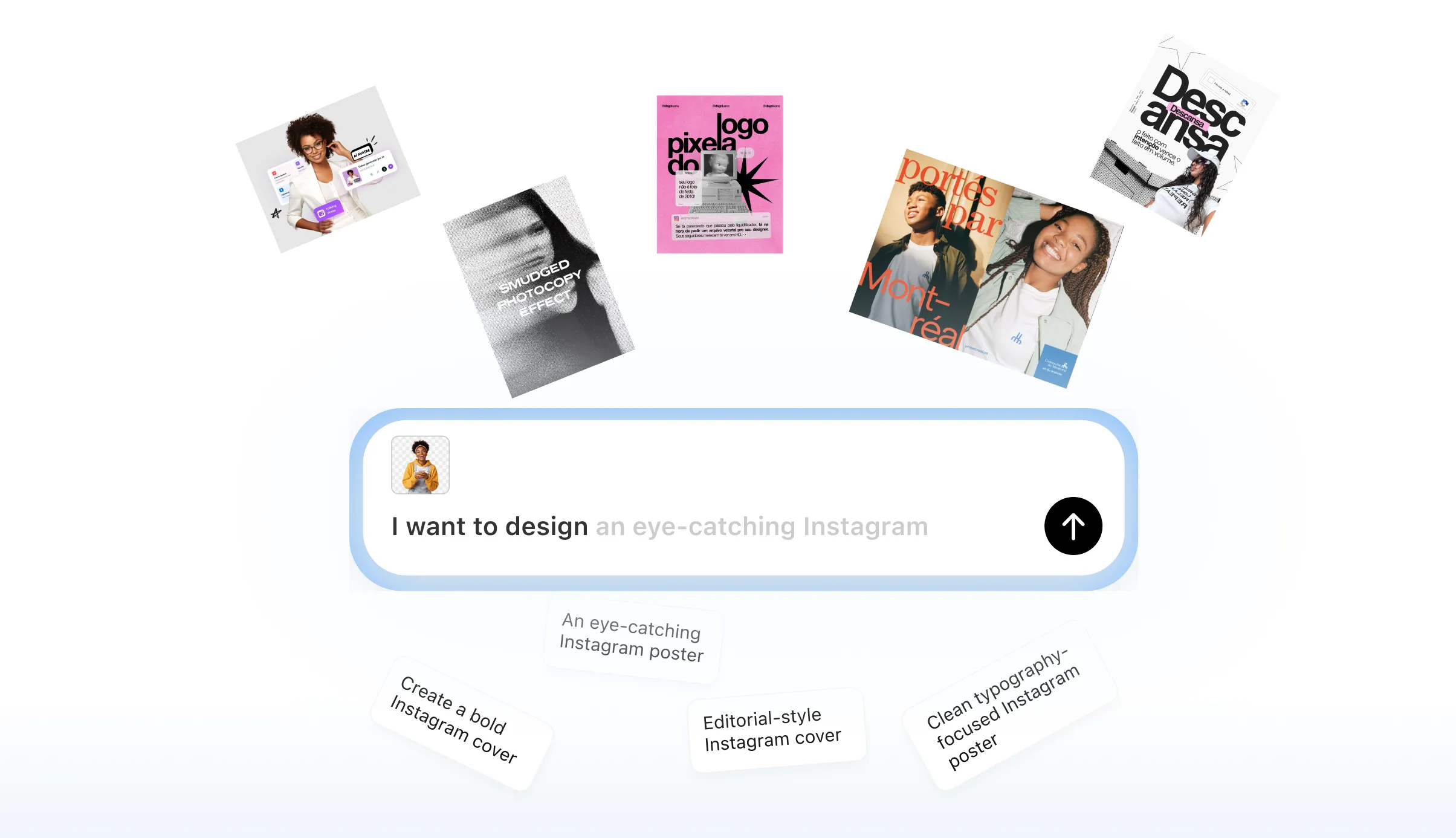
Apply the One-Idea-Per-Slide Rule Without Starting From Scratch
Restructuring a content-heavy slide deck by hand means rebuilding layouts one by one, which takes time most people don't have. When your content is already written, a design tool can redistribute it across properly scoped slides that each serve a single communicative purpose. You end up with a cleaner content format and a slide pacing rhythm that actually holds attention.
Try It Free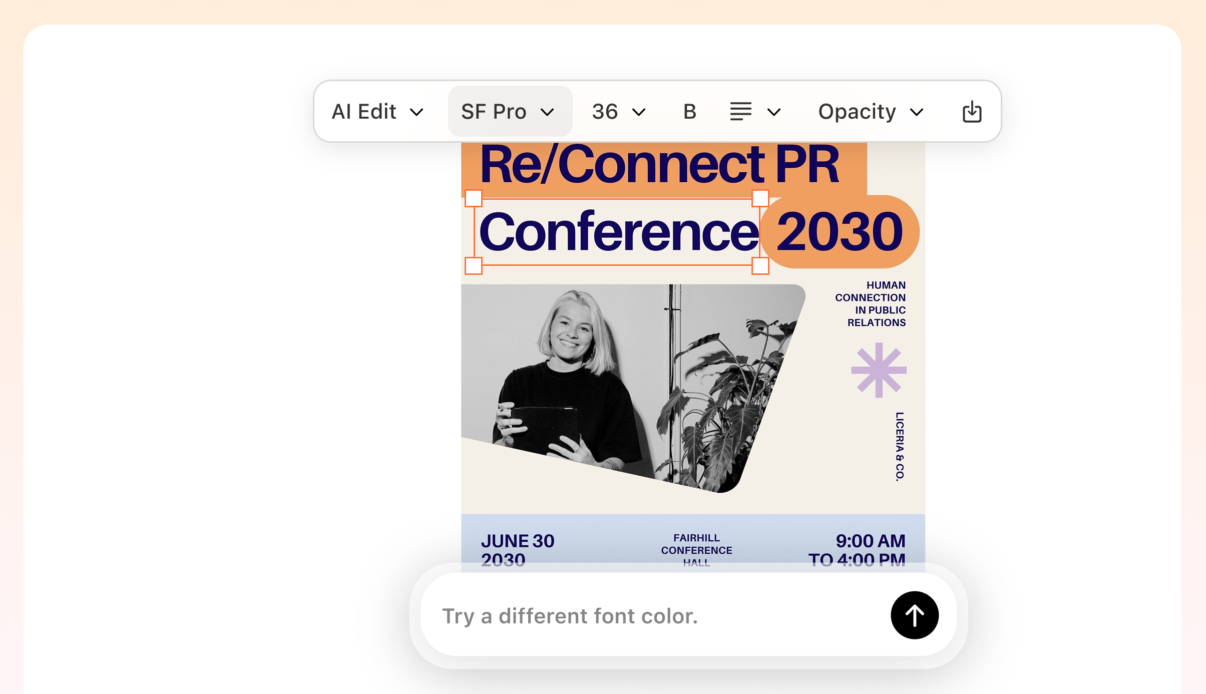
Match Your Slide Density Format to Your Delivery Context
A deck you present live in a room needs a very different text-to-visual ratio than a leave-behind reference document your audience reads alone. Getting that wrong means either under-explaining in an async context or overwhelming a live audience with walls of text. Editable slide layouts let you adapt the same core content into the right density format for each situation.
Try It Free
Keep Hierarchy Visible When You Add Supporting Evidence
Adding data, labels, and evidence to a slide is where visual noise usually creeps in and readability drops. The challenge is showing enough detail to be credible without burying the main claim under supporting material. A structured layout with clear slide hierarchy keeps your primary point prominent while evidence stays readable and secondary.
Try It Free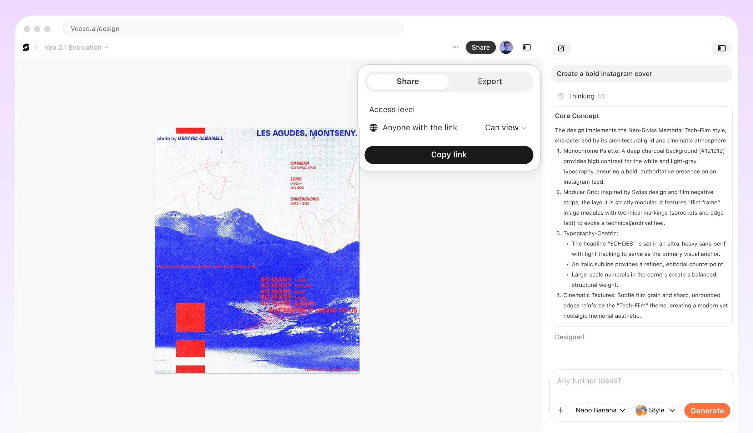
Who Uses a Presentation Slide Content Density Guide and When Does It Matter Most?
Academic Researcher Preparing a Conference Poster Presentation
You have six months of data to share in a 15-minute slot, and every slide feels packed. The fix starts with the single-purpose slide principle: each slide carries one finding, not three. Strip bullet points down to a single claim, then let your spoken words fill the gaps. Move supporting statistics to a clearly labeled chart rather than a text block. When your audience can scan the slide in under five seconds, they spend the rest of the time listening to you instead of reading past you.
Sales Team Building a Leave-Behind Deck for Enterprise Clients
A leave-behind deck gets read without you in the room, so the content-heavy slide design rules shift. Each slide needs enough context to stand alone, but visual noise still kills comprehension. Use a consistent slide hierarchy: one headline that states the point, one supporting visual or table, and no more than three labeled data points per view. Avoid stacking bullet points that repeat what the chart already shows. Readers will skim in a Z-pattern, so place your most critical evidence in the top-left and bottom-right zones of each slide.
High School Teacher Designing a Lesson Deck for a Mixed-Ability Class
Students lose the thread fast when slides feel like textbook pages. Readable slide pacing matters more here than in almost any other setting because your audience can't pause and reread. Aim for one concept per slide, use a short headline as the lesson anchor, and keep body text to a single sentence or a tight two-item list. Diagrams and labeled visuals replace paragraphs without reducing rigor. If a slide needs more than 40 words to make sense, split it. Chunking information this way also helps students take cleaner notes.
Startup Founder Pitching Investors in a Seed Round
Investors scan pitch decks quickly, often in under three minutes before a meeting. Dense slides signal unclear thinking, not thoroughness. Each slide should answer exactly one question: market size, problem, solution, traction, or ask. Keep labels on charts short and direct. If your revenue chart needs a paragraph to explain it, the chart is doing the wrong job. Veeso AI can help you turn a rough content outline into a clean, print-ready slide layout where every text box and data label is still fully editable, so you can refine the deck right up to the meeting.
HR Manager Creating an Onboarding Deck for New Hires Across Multiple Departments
Onboarding decks often grow into 60-slide monsters because every team wants their section included. The result is cognitive overload before the new hire reaches their desk. Apply a strict content-per-slide audit: if a slide covers two separate processes, split it into two slides with clear titles. Use numbered steps diagrams for sequential tasks instead of dense bullet lists. Group related slides into clearly labeled sections so the deck has a pacing rhythm and new hires can return to specific parts later without rereading everything.
Nonprofit Communications Lead Presenting Impact Data to a Board of Directors
Board members want evidence, not decoration, but a data-dense slide still loses the room if labels are unclear or charts compete for attention. Prioritize one data story per slide: program reach, cost per outcome, or year-over-year change, never all three at once. Use white space deliberately to separate the headline insight from the supporting figure. Veeso AI lets you import a structured document and generate editable visual pages, so you can turn a dense Word report into a clean slide-format layout without rebuilding every chart by hand.
Why consultants, educators, and corporate team leads Choose Veeso AI
How to Create High-Converting structured slide visuals
Define Your Delivery Context and Audience Before You Design Anything
Decide whether your deck will be presented live, sent asynchronously, or used as a printed reference. This single decision determines the right content density format for every slide you build, and it should come before you touch any layout.
Assign One Clear Purpose to Each Slide in Your Outline
Go through your content and give every slide a single job: make one claim, show one data point, or answer one question. If a slide is trying to do two things, split it. This is the foundation of readable slide pacing and strong information chunking.
Apply a Word Count and Element Count Check to Every Slide
For live presentations, aim for no more than 40 to 50 words per slide and no more than five visual elements including text blocks, images, and labels. For reference decks, you can go higher, but every element still needs to serve the slide's stated purpose. Cut anything that doesn't directly support the main claim.
Build or Refine Your Layouts With a Tool That Respects Your Content Structure
Once your content is scoped and structured, turn it into polished slide visuals that reflect the density decisions you've already made. Veeso AI lets you import your structured content or start from a density-matched template, so the visual output reinforces your hierarchy rather than fighting it.
FAQ

Ready to Create Beautiful Presentation Design Assets with Veeso AI?
Start Creating NowNo credit card required • Free to start • No design skills required
Explore More AI Graphic Design Use Cases
Discover more creative design scenarios powered by Veeso AI.