Instagram Carousel Safe Zone Spacing Guide
Keep your text, logos, and CTAs clear of Instagram's UI on every slide. Learn the exact pixel margins and safe area rules for carousel posts. Apply them once and nothing important gets cropped again.

Three Ways to Generate carousel slide design sets
Describe Your Carousel Concept and Get a Safe-Zone-Ready Layout
Tell the AI what your carousel is about — the topic, tone, number of slides, and format — and it builds a structured layout with safe zone spacing already baked in. You don't have to manually place guides or calculate insets from scratch. Every text box and visual element lands inside the instagram carousel safe area from the start.
- Artboard dimensions set to your chosen aspect ratio — 1:1, 4:5, or 9:16 — automatically
- Text blocks placed inside the interface-safe zone, away from swipe dots and icon overlap
- Slide-to-slide margin gutters kept consistent so swipe continuity alignment holds
- All layers stay fully editable so you can adjust copy, colors, and images after generation
Start From a Carousel Template With Safe Zone Guides Already Set
Pick a carousel slide template that matches your content style — educational, product showcase, step-by-step guide — and get an artboard that already has the correct safe zone overlay built in for your format. You swap in your own text, images, and brand colors without touching the underlying guide structure. The instagram carousel margins stay intact while everything else is yours to change.
- Templates available for 1080×1080 px square, 1080×1350 px portrait, and 1080×1920 px vertical formats
- Pre-set bleed zone fills so background color and imagery extend edge to edge without risk
- Typographic safe zone markers visible during editing, hidden on export
- Coordinated slide styles across a full carousel set so every slide looks like it belongs together
Import Your Existing Content and Get Structured Carousel Slides
If you've already written your carousel copy in a doc, a PDF, or a Markdown file, you can import it directly and have it mapped into a multi-slide layout with proper instagram safe zone spacing applied. The tool structures your content into individual slides and places each block inside the readable margin zone. You skip the blank-canvas stage entirely and go straight to refining the design.
- PDF, Word, and Markdown import maps content into separate slides automatically
- Each imported text block is positioned within the carousel UI element clearance zone
- Slide count adjusts to your content length without manual artboard duplication
- Every imported element remains editable — move, resize, or restyle any layer after import
Why choose Veeso for your print-ready carousel visual assets
Keep Text Inside the Instagram Safe Area on Every Slide
Carousel slides that look perfect in your design tool can still get cropped or covered by Instagram's UI chrome — the heart icon, username bar, and swipe dots all eat into your canvas. Designing with precise safe zone insets built into your layout prevents that from happening. You end up with slides where every headline, price, and call to action stays fully visible on every device.
Try It Free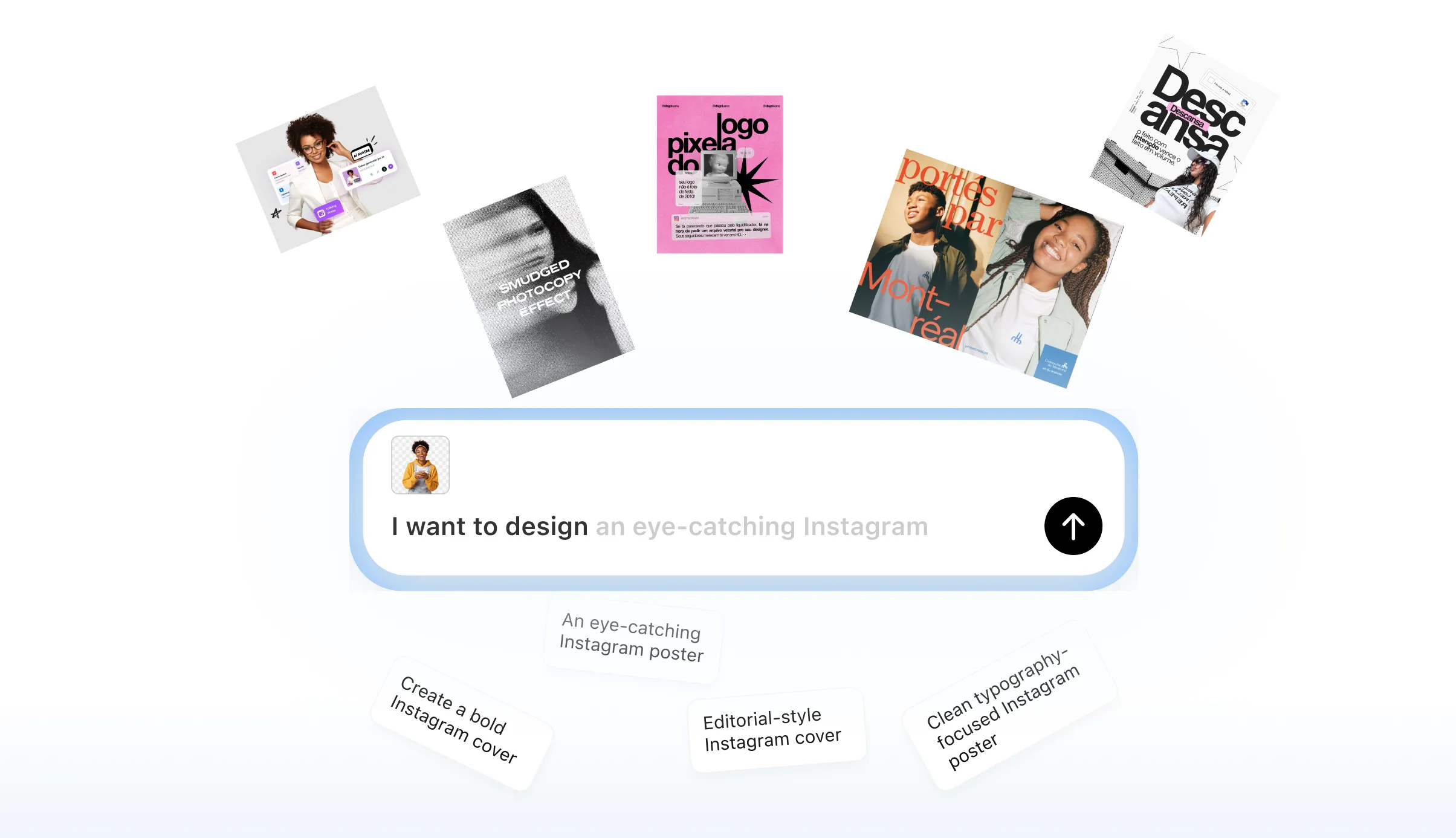
Match Margins Across All Slides for Clean Swipe Continuity
When a spanning visual or repeated text block shifts even a few pixels between slides, the swipe feels broken and unprofessional. Working from a consistent artboard with locked guide coordinates keeps your carousel slide padding identical from slide one to the last. The result is a smooth, intentional slide-to-slide visual flow that looks deliberate rather than accidental.
Try It Free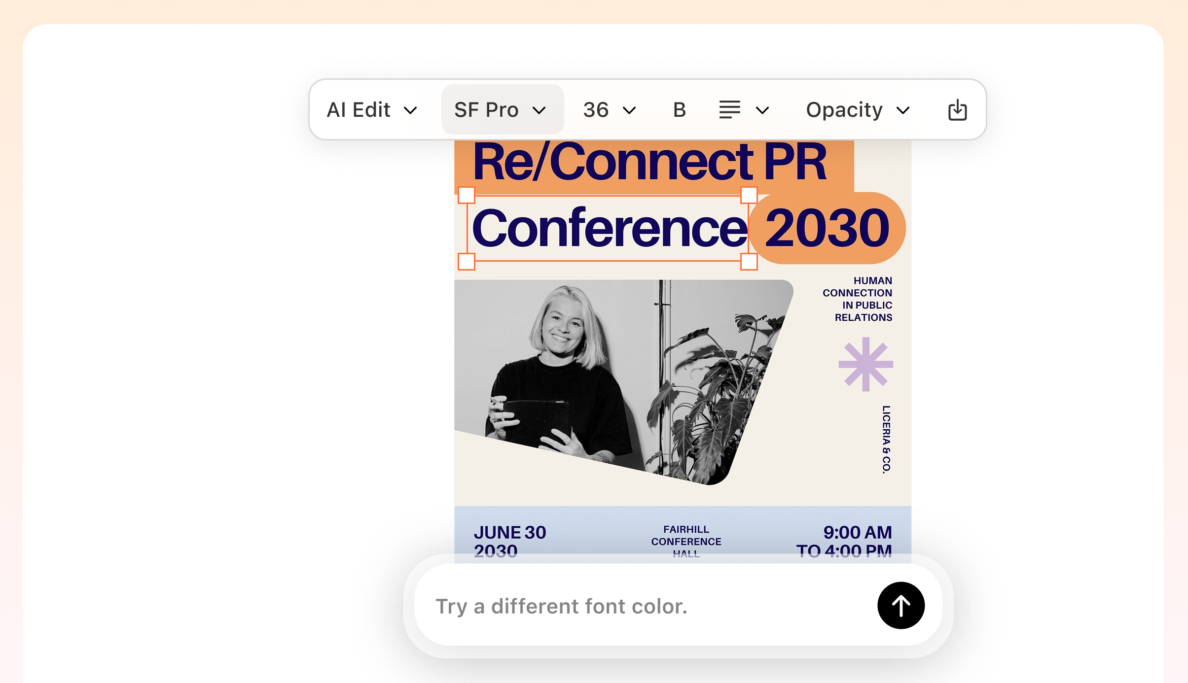
Switch Between 1:1, 4:5, and 9:16 Formats Without Rebuilding From Scratch
A campaign often needs the same carousel content adapted across square, portrait, and vertical formats, each with different safe zone insets and bleed zone boundaries. Rebuilding layouts manually for each aspect ratio wastes time and introduces inconsistency. An editable design layout lets you resize the artboard and adjust guides once, then carry the same content through every format cleanly.
Try It Free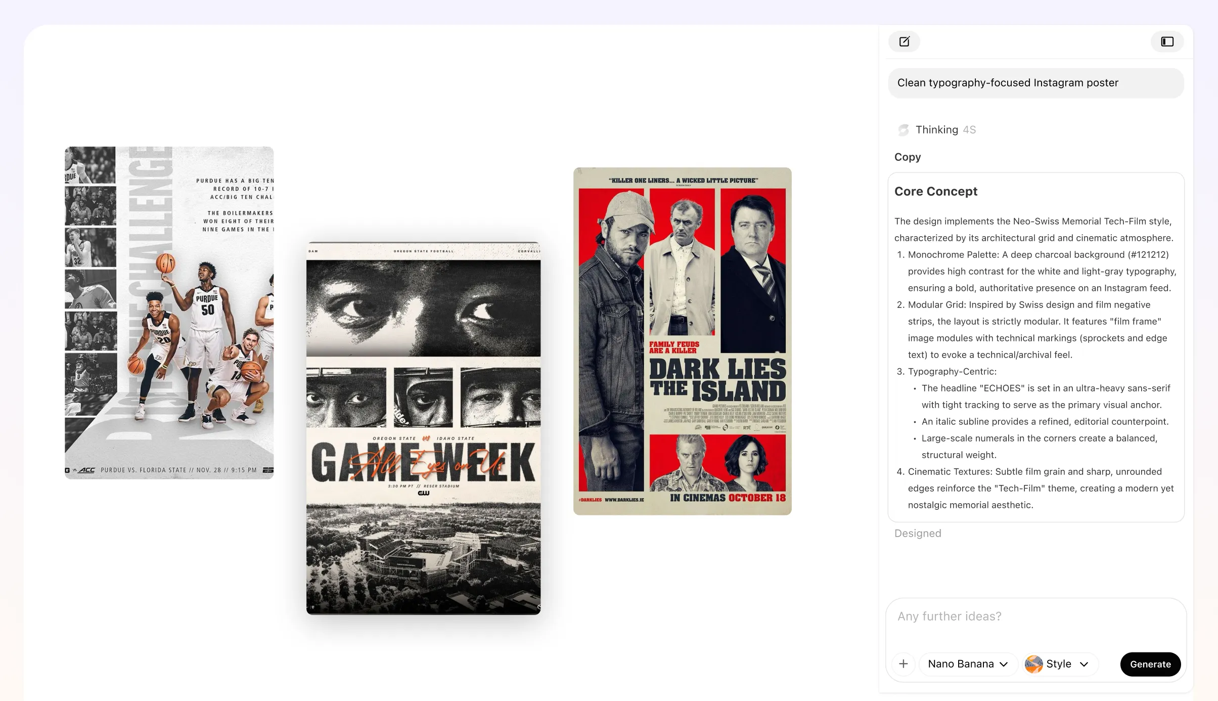
Export Slides That Are Ready to Upload Without Last-Minute Fixes
Discovering a cropped headline or a logo sitting under a swipe dot after you've already exported ten slides is a frustrating way to lose an hour. Building safe zone guides directly into your carousel layout catches those problems before export, not after. You get production-ready PNG or PDF files that go straight to Instagram without a round of corrections.
Try It Free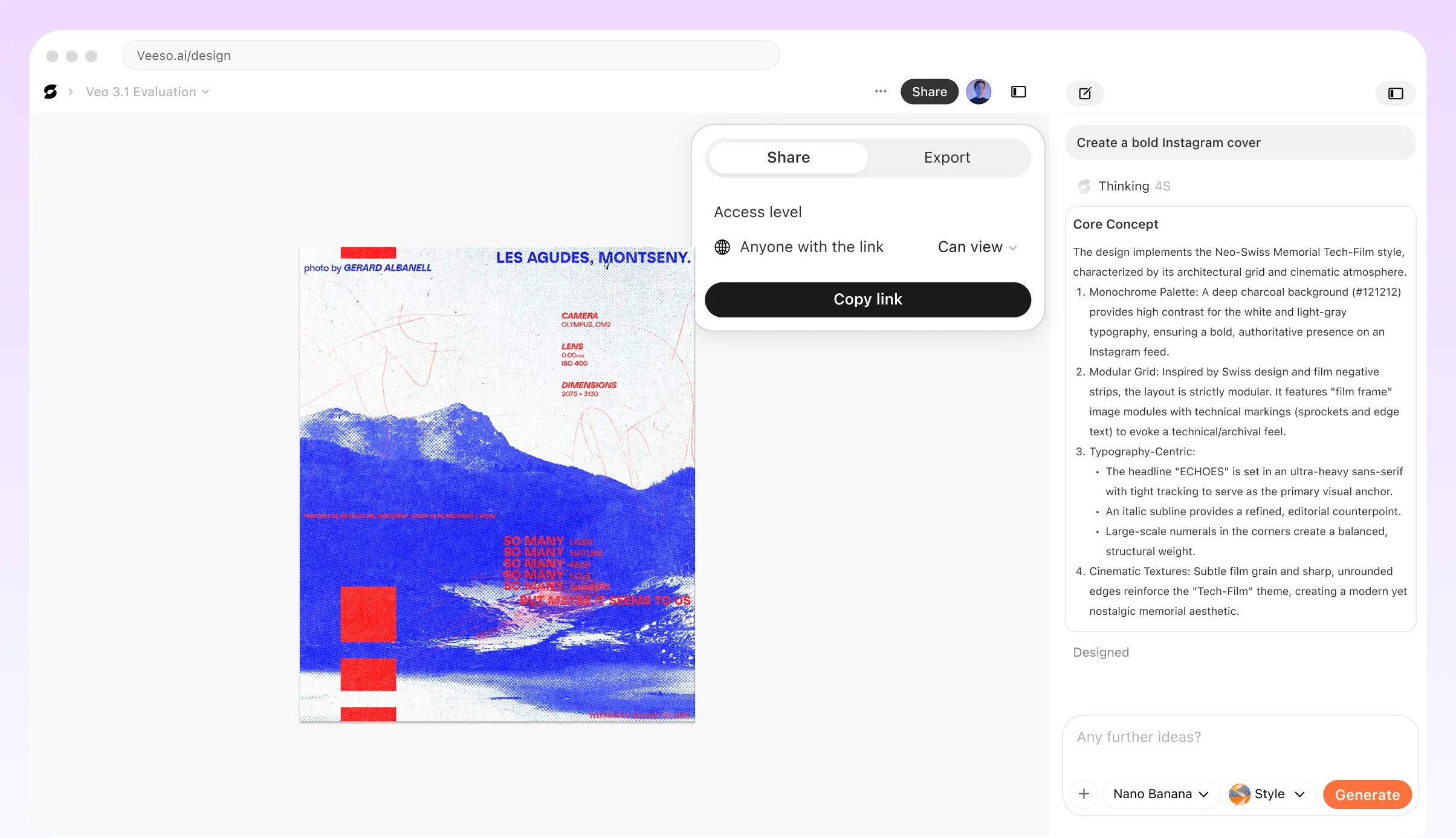
Who Needs an Instagram Carousel Safe Zone Spacing Guide?
Brand Designer Building a Reusable Carousel Template System
You're a brand designer who produces carousels every week for multiple clients. Setting up a master overlay file with correct instagram carousel safe zone guides once saves you from re-checking margins on every new project. Map out the interface chrome overlap areas, define your content safe area as a locked layer, and build slide padding rules into your base template. When a new brief arrives, you drop content into the frame knowing logos, CTAs, and headlines all sit inside readable margins and won't be clipped by Instagram's UI elements on any device.
Social Media Manager Auditing a Carousel Before Paid Ad Submission
You've finished a product carousel and it's about to go live as a paid ad. Instagram ad safe zone rules are stricter than organic post requirements because the ad label and action buttons take up additional screen real estate at the bottom of each slide. Before submission, lay an instagram safe zone overlay on every frame and check that your CTA copy, price callouts, and brand logo clear the bleed zone by enough margin. Catching a cropped headline at this stage is far cheaper than pausing a live campaign to fix it.
Content Creator Designing a Panoramic Spanning Visual Across Slides
You want a wide landscape image to stretch continuously from slide one through slide five, giving viewers a reason to keep swiping. Swipe continuity alignment only works when you account for the safe area on both the left and right edges of each slide. If a key part of the image lands inside the interface-safe placement zone on the trailing edge of one slide, it gets hidden until the viewer swipes, breaking the visual flow. Plan your panoramic composition so nothing critical sits within those edge gutters, and test the slide-to-slide visual flow on a real device before publishing.
Freelance Graphic Designer Explaining Specs to a Non-Technical Client
Your client keeps asking why their logo looks cut off even though it looks fine in the design file. The gap between what a design tool shows and what Instagram actually renders comes down to UI element clearance: the profile icon, the slide counter dots, and the caption area all overlap parts of the frame. A simple annotated spec sheet showing the instagram carousel margins, the safe content area, and the exact pixel dimensions for 2026 gives your client a visual reference they can understand without a design background. It also sets clear expectations before the next round of revisions.
Small Business Owner Creating a Product Education Carousel Without a Design Team
You sell handmade goods and want to walk followers through your process in a five-slide carousel, but you don't have a designer on staff. The biggest risk is placing product names or step numbers too close to the edges, where Instagram's interface chrome overlaps the frame. Start from a template sized to the 4:5 portrait aspect ratio, which is the most common instagram carousel dimension for feed posts, and keep all text inside the typographic safe zone. Tools like Veeso AI let you paste your copy and get an editable layout where margin gutters are already built into the design, so you're not guessing at spacing.
Marketing Team Lead Standardising Safe Zone Rules Across a Campaign Content Set
Your team is producing a multi-week campaign with carousels, Reels, and feed posts, and different designers are working on each format. Without a shared reference, one designer uses instagram reel safe zone dimensions on a carousel slide, and another ignores the bottom safe area entirely. Document the carousel-specific rules separately from Stories and Reels specs, since each format has different UI element clearance requirements. Veeso AI can help the team produce coordinated, editable visual assets from a shared style starting point, but the safe zone spec sheet itself should live in your brief so every designer applies the same instagram safe area for feed before exporting.
Why social media managers, freelance graphic designers, and small business owners Choose Veeso AI
How to Create High-Converting editable carousel slide layouts
Choose Your Carousel Format and Set the Correct Artboard Dimensions
Decide whether your carousel will be square (1080×1080 px), portrait (1080×1350 px), or vertical (1080×1920 px), since each format has different safe zone insets. Starting with the right canvas size means your instagram carousel margins will be accurate from the first slide.
Add Safe Zone Guides to Define Your Interface-Safe Placement Area
Place guide lines at the correct pixel coordinates for your chosen format to mark where Instagram's UI chrome — swipe dots, action icons, and the username bar — overlaps your canvas. Keeping all critical content inside these guides protects your text and visuals from being obscured on any device.
Place Your Content Inside the Safe Area and Fill the Bleed Zone With Background
Position every headline, subhead, logo, and call to action inside the safe zone boundary, then extend your background color or image all the way to the canvas edge to fill the bleed zone cleanly. This separation between content placement and background fill is what makes carousel slides look polished and intentional.
Check Swipe Continuity Alignment Across All Slides, Then Export
Before exporting, scroll through all slides side by side and confirm that any spanning visual or repeated element sits at the same vertical position on each artboard. Once the slide-to-slide visual flow looks consistent, export each slide as a high-resolution PNG and upload the set to Instagram.
FAQ

Ready to Create Beautiful Print-Ready Carousel Visual Assets with Veeso AI?
Start Creating NowNo credit card required • Free to start • No design skills required
Explore More AI Graphic Design Use Cases
Discover more creative design scenarios powered by Veeso AI.