Design pro charts with our free graph generator
Turn your data into beautiful visuals instantly. This online chart maker creates high-resolution exports. Perfect for your next big report.

Tres formas de generar professional graph design
Describe Your Vision to the AI Graph Maker
Just tell the tool what you're trying to show. Veeso AI builds the layout, picks the colors, and labels everything.
- Natural language design prompts
- Auto-generated axis labels
- Custom color hex codes
- Instant layout suggestions
Pick a Free Chart Template
Browse a library of professional scatter plots and line graphs. Choose a vibe that fits your presentation and swap the data.
- Minimalist design styles
- Professional sans-serif fonts
- Pre-set high-contrast palettes
- Generous white space layouts
Import Data for Professional Graph Design
Copy your numbers from a sheet and paste them in. You get a polished visual that's ready for any report.
- Easy CSV data import
- Fully editable text layers
- Custom data callouts
- Source and footnote sections
¿Por qué elegir Veeso para tu print-ready data visualization
Clean Labels That Make Sense
Don't let messy axis labels ruin your research paper. You get perfectly spaced text and clean grid lines every time.
Pruébalo gratis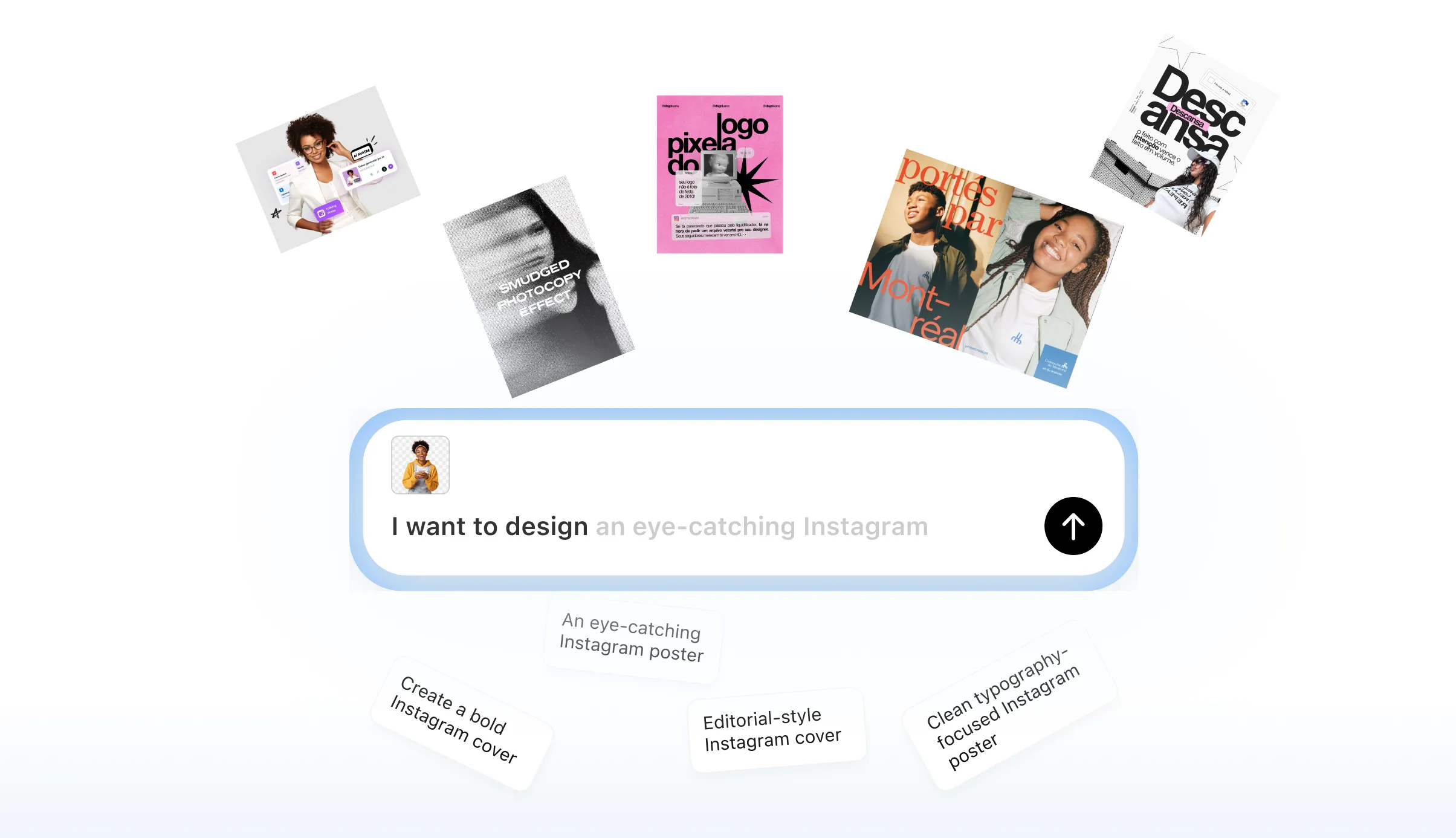
Pro Style for Board Meetings
Spreadsheets often look clunky in a slide deck. Veeso AI builds sleek graphs with professional typography that matches your brand.
Pruébalo gratis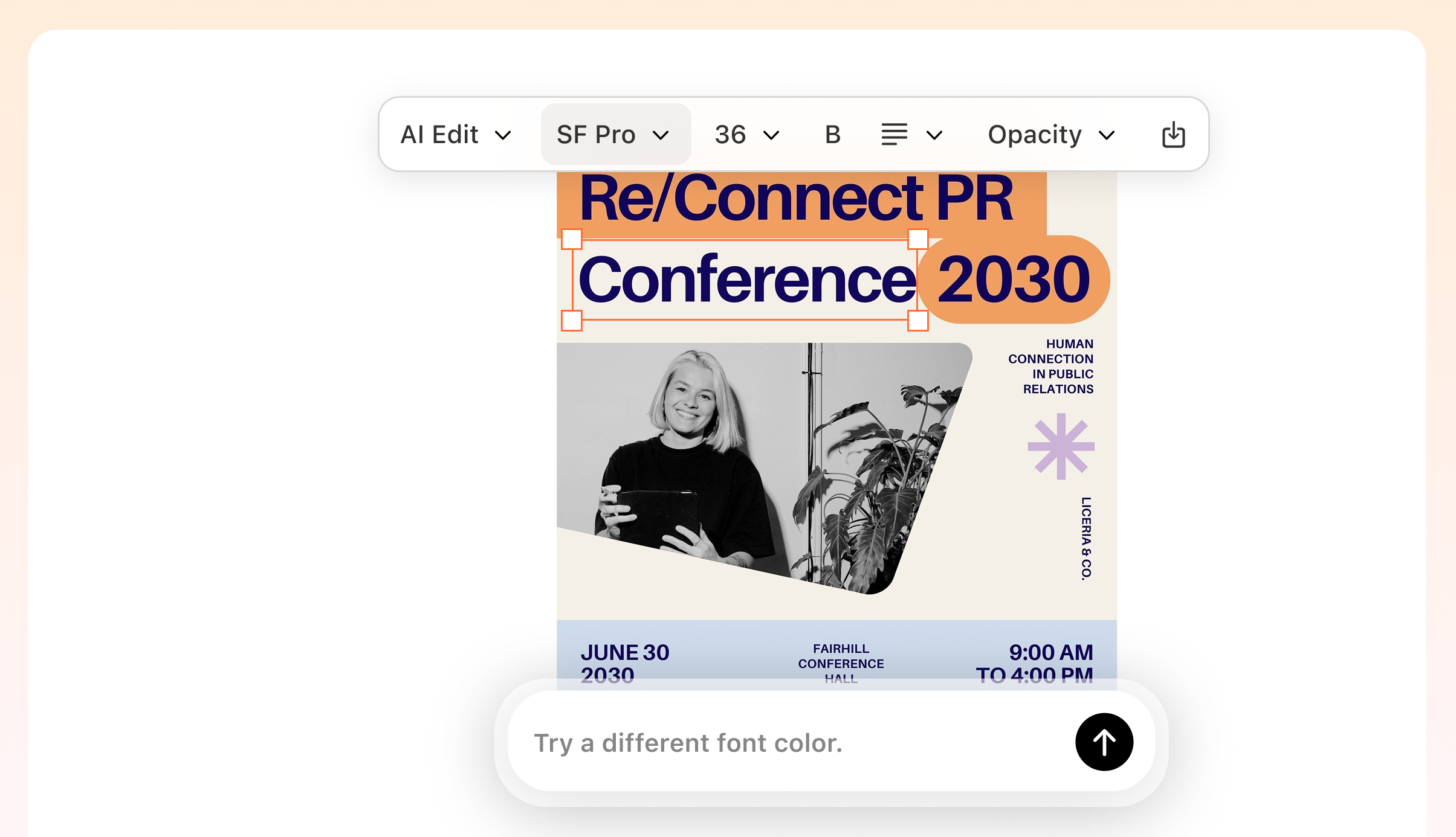
Sharp 300 DPI Print Exports
Need your data visualization in a printed report? Download high-res files that stay crisp on paper, not just screens.
Pruébalo gratis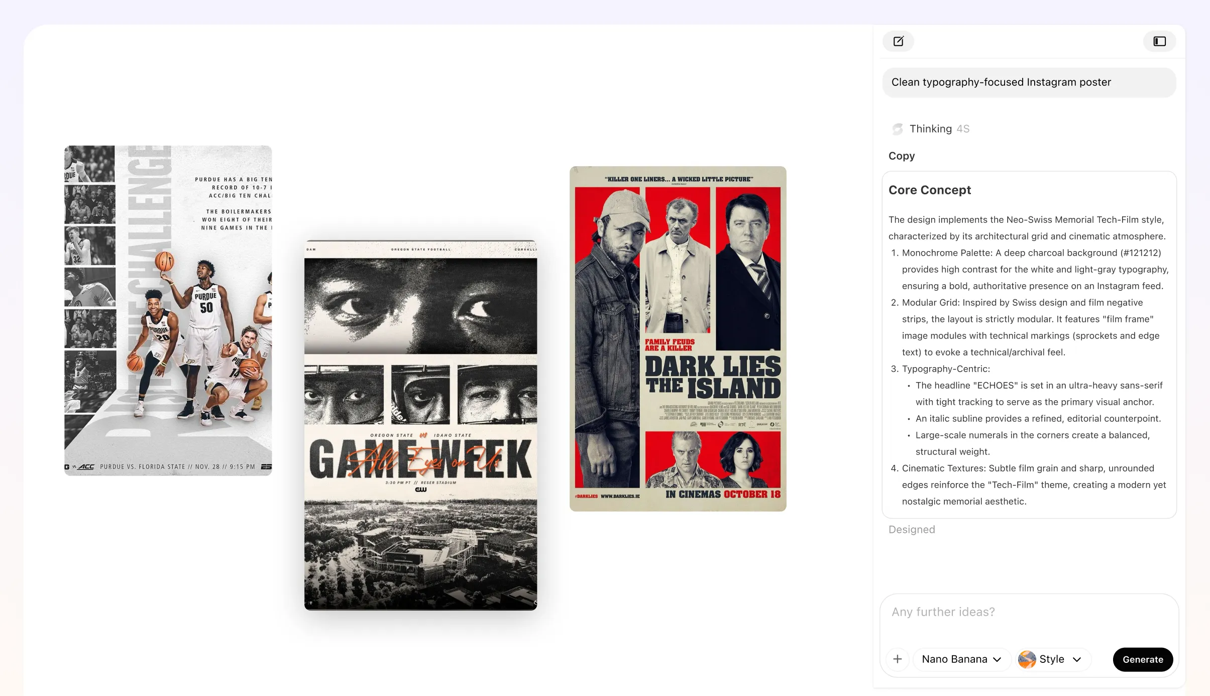
Quick Custom Graph Builder
Stop fighting with rows and columns. Just drop in your data points and see a beautiful layout instantly.
Pruébalo gratis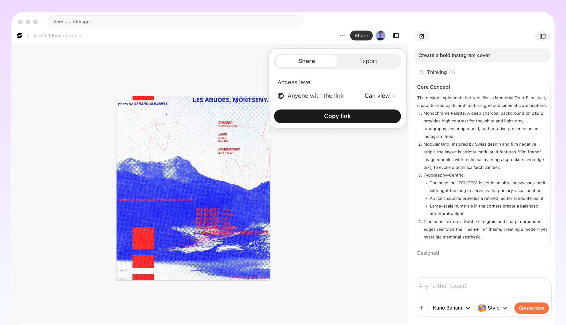
Who Needs a Professional Graph Generator?
Custom Graph Builder for Board Meetings
You have a big presentation tomorrow. Turn your spreadsheet into a clean, brand-consistent chart. Pick your hex codes and get a 16:9 slide ready.
Professional Graph Design for Research
Getting published requires high-resolution visuals. Export your data as a 300 DPI PDF or SVG. Ensure every axis label is crisp and clear.
Free Online Graph Maker for Client Reports
Impress your clients with minimalist, data-driven visuals. Drop in your CSV and watch a structured layout appear. It looks like you spent hours designing.
Create Graph Online Free for Your Blog
Complex data can be a snooze for readers. Break it down with a high-contrast scatter plot or bar chart. Download a sharp PNG for your post.
Best Graph Generator for Investor Pitches
You need to show growth without the fluff. Veeso AI builds charts that focus on your data points. Stick to professional fonts to keep things readable.
AI Graph Maker for Science Assignments
Stuck on a lab report with messy data? Get a precise plot with labeled grid lines in seconds. No sign up needed to start your project.
Por qué data analysts and business consultants eligen Veeso AI
Needed to visualize complex quarterly stats for our annual report. I pasted my data and got an SVG with perfect margins. It saved me a whole afternoon.

Academic journals are picky about DPI settings and font legibility. Veeso AI handled the 300 DPI export effortlessly. My charts looked sharp in the final PDF.

I used to struggle with making charts match my client’s brand. Now I just drop in the CSV and pick the hex colors. The minimalist style is perfect.

Cómo crear custom graph builder de alta conversión
Add Data to the Graph Generator
Paste your numbers or describe your vision. The layout engine handles the formatting for you.
Style Your Custom Graph Builder
Change fonts, tweak colors, and add labels. Make sure your legend and titles look exactly right.
Download Your Professional Graph Design
Hit download for a high-res PNG or PDF. Your charts are ready for print or presentations.
Preguntas frecuentes

Ready to Create Beautiful Print-Ready Data Visualization with Veeso AI?
Empieza a crear ahoraSin tarjeta de crédito • Gratis para empezar • Sin conocimientos de diseño
Explora más casos de uso de diseño gráfico con IA
Descubre más escenarios de diseño creativo con Veeso AI.