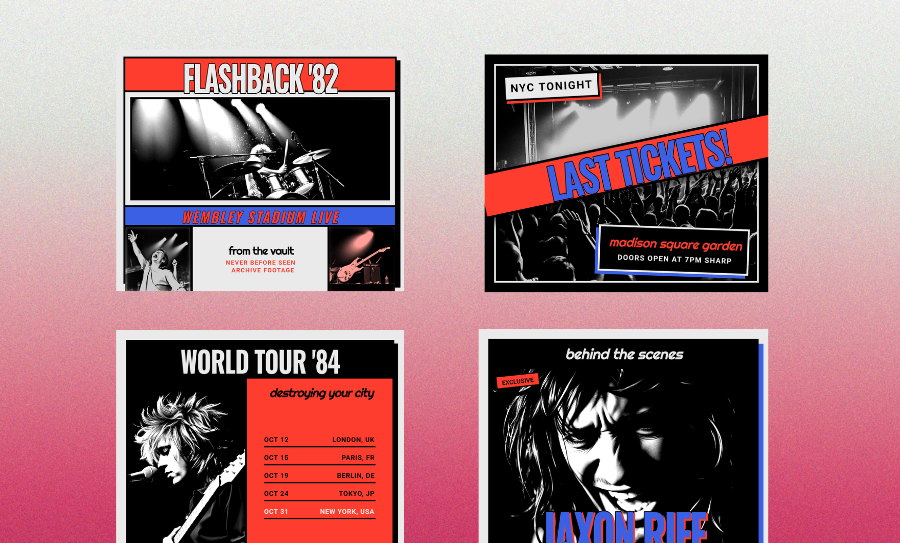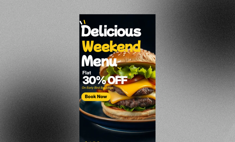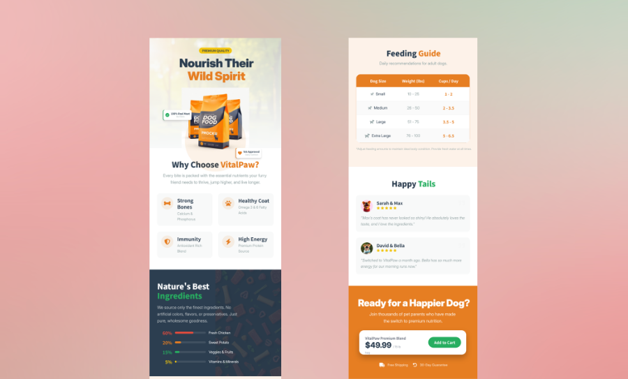
Event Poster Information Hierarchy Guide
Learn the right order to present your event details so viewers get the key facts in seconds. Place your headline, date, location, and call to action where eyes naturally land. Export a print-ready PNG or PDF once your layout is locked.
Three Ways to Generate event poster and flyer visual assets
Describe Your Event and Let the Layout Take Shape Around Your Content
Type in your event name, date, location, and any supporting details, and the design builds itself around that information in a structured hierarchy. This approach works well when you know what you need to say but haven't decided how to arrange it visually. Veeso AI treats your copy as the starting point, so the headline lands at the top of the reading order where it belongs.
- Headline placed at the dominant visual weight automatically
- Date and time positioned in the second-tier reading zone
- Location and supporting details scaled down to the third layer
- Call to action anchored at the bottom with clear contrast from body text
Start From an Event Poster Template With a Built-In Hierarchy Structure
Pick a layout that already has the five content layers in the right order — event promise at the top, logistics in the middle, CTA at the base — and swap in your own text, colors, and images. Templates are useful when you're working against a deadline and need a proven flyer hierarchy structure to build on. Every element stays editable, so you can adjust typographic scale and spacing to match your event's tone.
- Pre-set typographic scale separates headline from supporting details
- Placeholder zones for date, venue, and ticket information already sized correctly
- Color weight assignments you can update without breaking the reading order
- White space built into the layout to prevent visual crowding around key details
Import Your Event Copy and Transform It Into a Structured Flyer Layout
If you've already written your event details in a Word doc, a PDF brief, or a Markdown file, you can bring that content straight into a design environment instead of retyping it. The tool maps your text into a structured visual layout, placing each piece of information at the right level of the hierarchy. You end up with an editable poster where the reading order reflects how a real viewer scans — not just how the content happened to land on the page.
- Import from PDF, Word, or Markdown without losing your event details
- Content mapped to hierarchy layers based on information type
- Each text block remains fully editable after import
- Export as high-resolution PDF or PNG ready for print or digital distribution
Why choose Veeso for your print-ready event poster design
Keep Your Event Details in the Right Reading Order
When someone glances at your poster for two seconds, they need to catch the event name first, then the date, then where to show up. If those layers are out of order or visually equal, the poster fails before anyone reads it. An editable layout tool lets you adjust size, weight, and placement until the hierarchy actually works the way a real viewer's eye moves.
Try It Free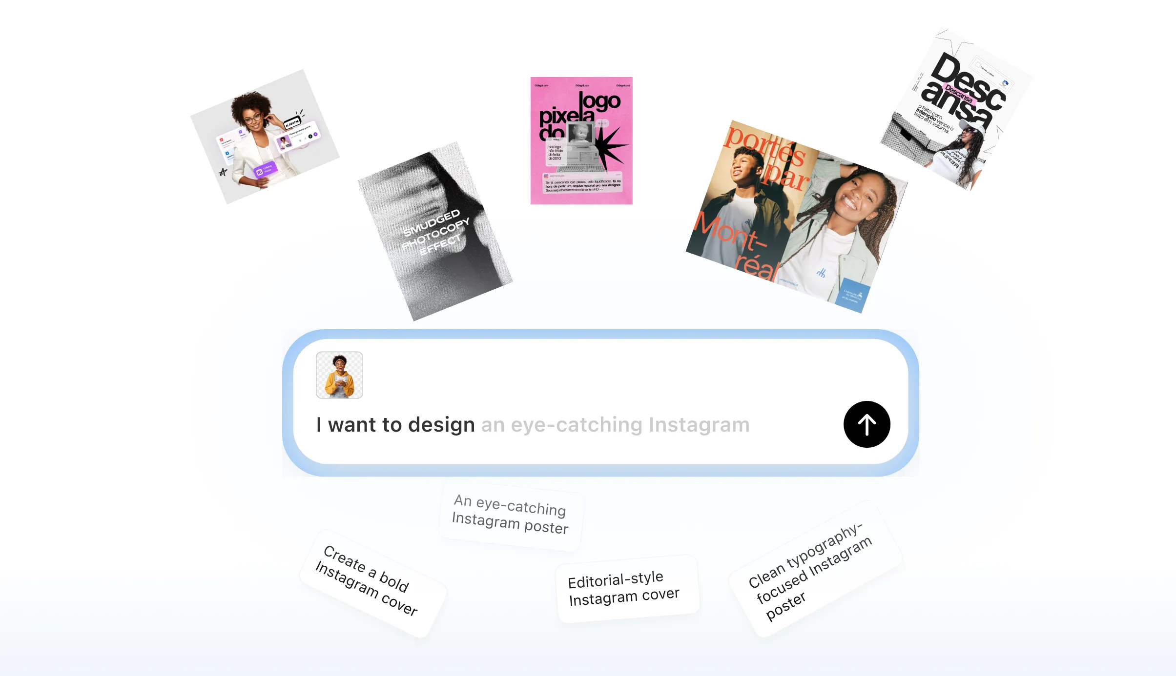
Fix Hierarchy Problems Before You Print
Printing 200 flyers only to find the venue name is smaller than the sponsor logo is an expensive mistake. Working in a fully editable design environment means you can shift typographic scale, reorder layers, and test contrast before a single sheet goes to the printer. You catch the structural problems at the screen stage, not the wall stage.
Try It Free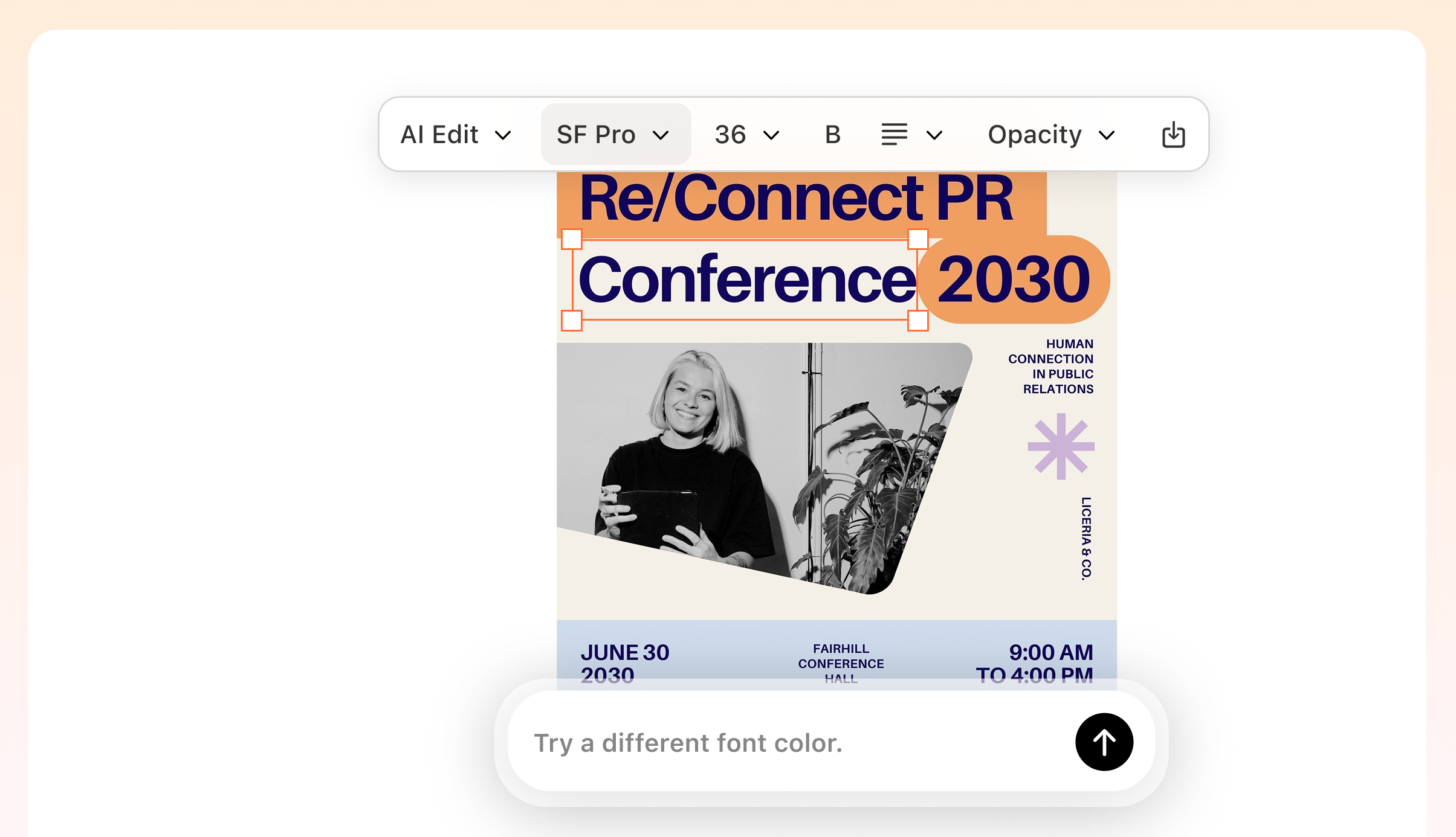
Match the Poster Layout to How People Scan in the Real World
A poster on a crowded bulletin board competes with a dozen others. A flyer shared as an Instagram story gets swiped past in under two seconds. The layout decisions that work in one context — focal point placement, white space as a separator, color weight on the headline — need to hold up in both. Starting from a content-first layout means the structure is built around your information, not around a decorative frame you have to fight against.
Try It Free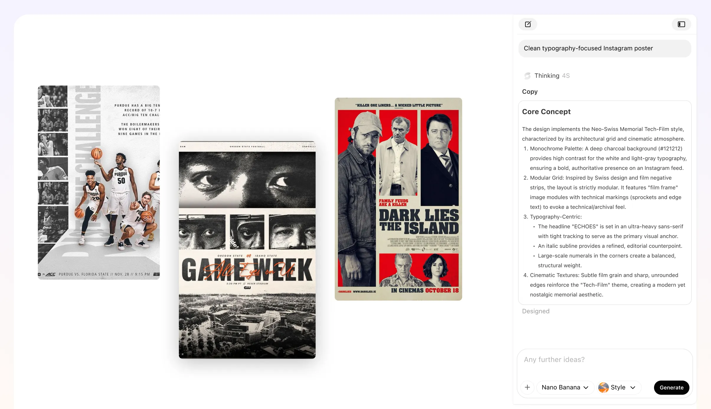
Produce Print-Ready Files Without Rebuilding the Design Each Time
Event posters often need to run in multiple sizes — an A3 for the venue wall, a square crop for social, a half-sheet for the door. Rebuilding the hierarchy from scratch for each format wastes time and introduces inconsistency. Exporting high-resolution PNG and PDF files from one editable source keeps the reading order and visual weight consistent across every version you hand off.
Try It Free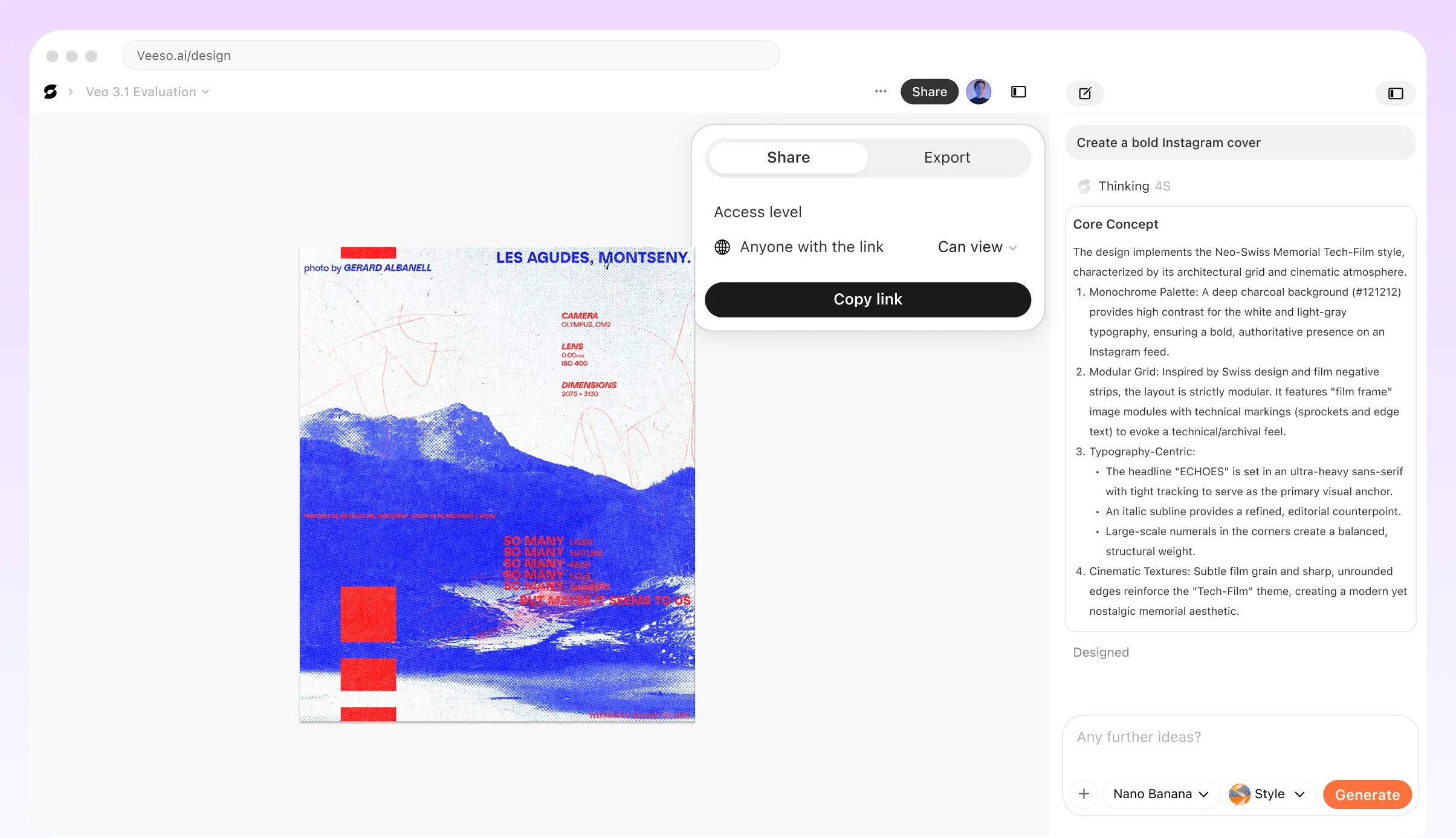
Who Needs an Event Poster Information Hierarchy Guide?
Community Theater Groups Promoting a Weekend Run
A local theater company needs to fill seats across three weekend performances. Their poster often buries the show title under decorative artwork, leaving the date and venue hard to find at a glance. Applying a clear poster text hierarchy fixes this fast. Lead with the show name at the largest scale, follow with the performance dates, then place the venue and ticket link lower in the layout. Supporting details like cast names and sponsor logos sit at the smallest visual weight. This order matches how a passerby scans a flyer on a community board in under three seconds.
Independent Music Promoters Building a Recurring Gig Poster Template
A promoter who books monthly shows at the same venue needs a repeatable flyer hierarchy structure that works across different headliners and genres. The challenge is keeping the event promise headline dominant while swapping performer names and dates without breaking the layout. Establishing a fixed typographic scale, where the headliner name sits one size below the event brand but well above support acts, creates a consistent reading flow. This system lets anyone on the team update the poster without accidentally giving equal visual weight to a support act and the headliner.
University Event Coordinators Designing Campus Festival Flyers
Campus events compete for attention on crowded bulletin boards and digital screens. A student activities coordinator often packs too much information onto one flyer, making it hard for viewers to identify the single most important detail. Applying professional event flyer visual hierarchy means choosing one focal point, usually the event name or a bold visual hook, and letting everything else rank below it in size and contrast. Date and location should appear in the top third of the layout. Fine print like accessibility notes or co-sponsor credits belongs at the bottom where it supports without competing.
Small Business Owners Creating a Grand Opening Event Poster
A shop owner announcing a grand opening wants the poster to communicate excitement and logistics at the same time. Without a clear event poster layout order, the business name, the date, and a promotional offer all fight for the same visual weight. The fix is to treat the event promise as the headline, the date and address as the second tier, and the offer as a supporting detail that reinforces the reason to show up. Veeso AI can help here by letting you paste your copy and immediately see how a structured layout distributes that information across a print-ready design.
Nonprofit Fundraiser Teams Balancing Sponsor Logos Against Event Details
Nonprofits often face pressure from sponsors to make logos prominent, which can push critical event information down the poster. A clear hierarchy in poster design resolves this tension by assigning sponsor logos a fixed zone, typically the bottom strip, and protecting the upper two-thirds for the event name, cause statement, date, and registration call to action. This approach respects sponsor visibility without letting logos compete with the event promise. It also makes the poster easier to scan for attendees who are deciding whether the event is relevant to them before they look at who funded it.
Freelance Designers Auditing a Client's Existing Event Flyer
A designer brought in to fix a poorly performing event flyer needs a clear framework for diagnosing what went wrong. Common problems include a date printed in the same size as the headline, a call to action buried below the fold, and social proof elements like testimonials or past attendance figures given more space than the venue address. Walking through the poster's visual hierarchy from top to bottom, and asking whether each element earns its size relative to its importance, reveals the gaps quickly. Veeso AI lets you rebuild the corrected layout in an editable format so the client can update future events without starting over.
Why event planners and small business owners Choose Veeso AI
How to Create High-Converting structured event flyer layout
List Your Event Information in Priority Order Before You Open Any Design Tool
Write down every piece of information your poster needs to carry, then rank it: event name first, date and time second, location third, social proof or supporting details fourth, call to action last. Knowing this order before you start designing means you're making layout decisions on purpose, not by accident.
Assign a Typographic Scale That Reflects Each Layer's Visual Weight
Your event headline should be noticeably larger than the date, and the date should be noticeably larger than the venue address. A clear size difference between each tier is what creates a scannable poster text hierarchy — if two pieces of information look the same size, viewers treat them as equally important and slow down to read everything at once.
Use Color, Contrast, and White Space to Reinforce the Reading Flow
High contrast on the headline pulls the eye in first. A secondary color or lighter weight on the logistics details signals that they come next. White space around the call to action separates it from the body of the poster so it reads as an action, not just more information.
Test the Layout at a Distance and at a Glance Before Exporting
Step back from your screen or shrink the file to thumbnail size and ask: can you read the event name and date in under three seconds? If the answer is no, the hierarchy isn't working yet. Once the reading order holds up at a glance, export a high-resolution PDF or PNG file that's ready for print or digital use.
FAQ

Ready to Create Beautiful Print-Ready Event Poster Design with Veeso AI?
Start Creating NowNo credit card required • Free to start • No design skills required
Explore More AI Graphic Design Use Cases
Discover more creative design scenarios powered by Veeso AI.