Email Header Dimensions & Mobile Crop Checklist
Get exact pixel specs, safe zone rules, and a repeatable pre-send checklist for email headers that render cleanly on mobile. Check your dimensions before you send. Export a production-ready header graphic that stays sharp on retina screens.
Three Ways to Generate responsive email header graphics
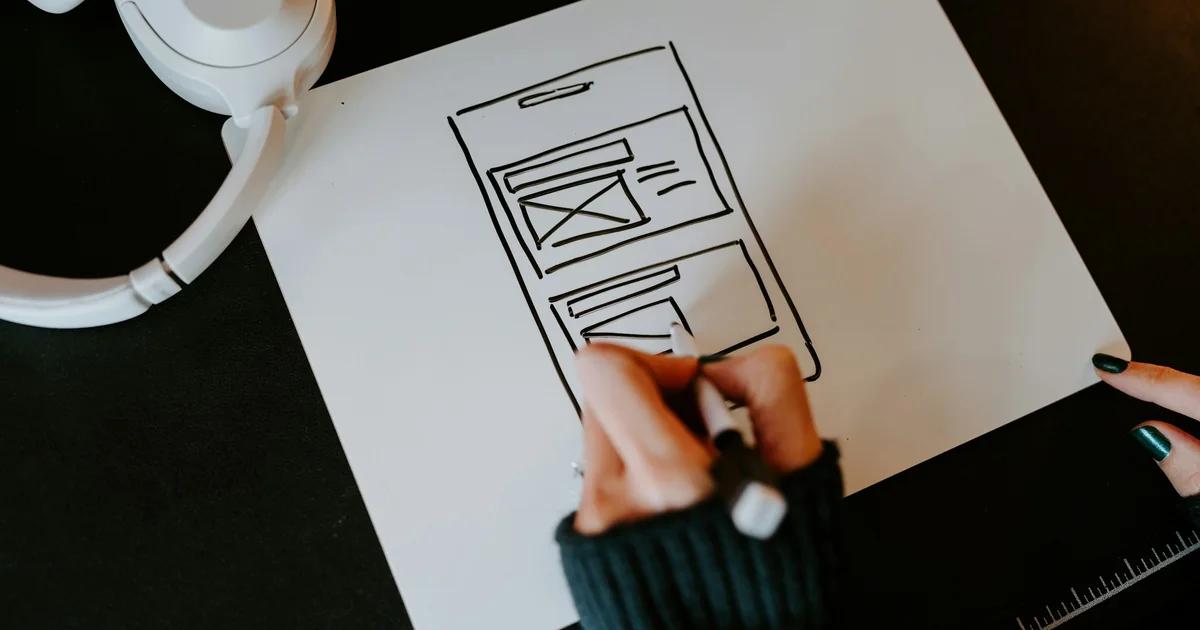
Describe Your Header Concept and Get a Responsive Layout Instantly
Type a short brief — your brand colors, the message you want above the fold, and the tone of the campaign — and let the AI build a structured header layout around it. This works especially well when you know what the header needs to say but haven't settled on a visual arrangement yet. You get an editable starting point that already respects standard container widths, so you're not retrofitting a pretty image into a spec it wasn't built for.
- Auto-places headline and subtext inside the mobile safe text area
- Applies a 600 px max-width container constraint from the start
- Generates a centered focal point that holds at 320 px and 425 px viewports
- Outputs a layered, editable file — not a flattened image
Start from an Email Header Template Built to Standard Banner Specs
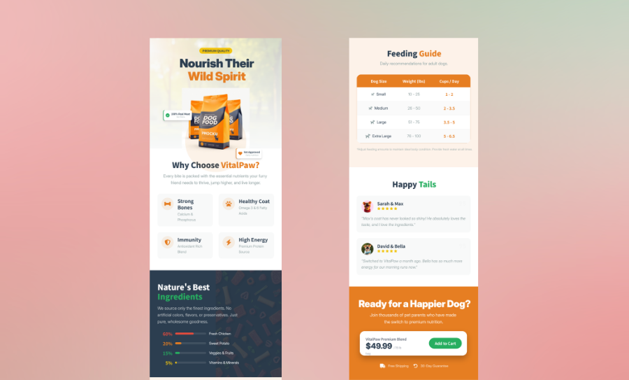
Pick a header template that already matches the standard email header size for your platform — whether that's a Mailchimp header, a Klaviyo banner, or a general-purpose 600 px layout. Swap in your own copy, brand colors, and imagery without touching the underlying dimension structure. Because the safe zones and container widths are already baked in, you spend your time on the creative, not the math.
- Templates pre-sized to 600 px desktop and retina-export ready at 1200 px
- Safe zone guides visible while editing so text never drifts into crop territory
- Editable text boxes, image layers, and color fields — nothing is locked
- Export as high-resolution PNG or PDF for upload to any email platform
Import Your Existing Copy and Turn It Into a Polished Header Graphic
If you've already written your subject line, preheader text, and campaign headline in a doc, you don't need to start over in a design tool. Paste or upload that content and the layout engine structures it into a header graphic that fits responsive email header dimensions. Every element stays editable, so you can adjust hierarchy, reposition text within the safe zone, and prep the file for a retina export before you hand it off.
- Accepts pasted text, Word docs, or Markdown as a content source
- Structures imported copy into a visual hierarchy suited to above-the-fold email content
- Maintains fluid image scaling behavior so the layout adapts across viewport widths
- Lets you reposition any element to stay within safe zone boundaries before export
Why choose Veeso for your mobile-safe email banner visuals
Keep Text Inside the Mobile Safe Zone Every Time
On small screens, email clients like Gmail Android and iOS Mail clip the outer edges of your header graphic. If your headline or logo sits too close to those edges, it disappears before the reader ever sees it. Working from a layout that already maps the safe text area means you stop guessing and start placing copy with confidence.
Try It Free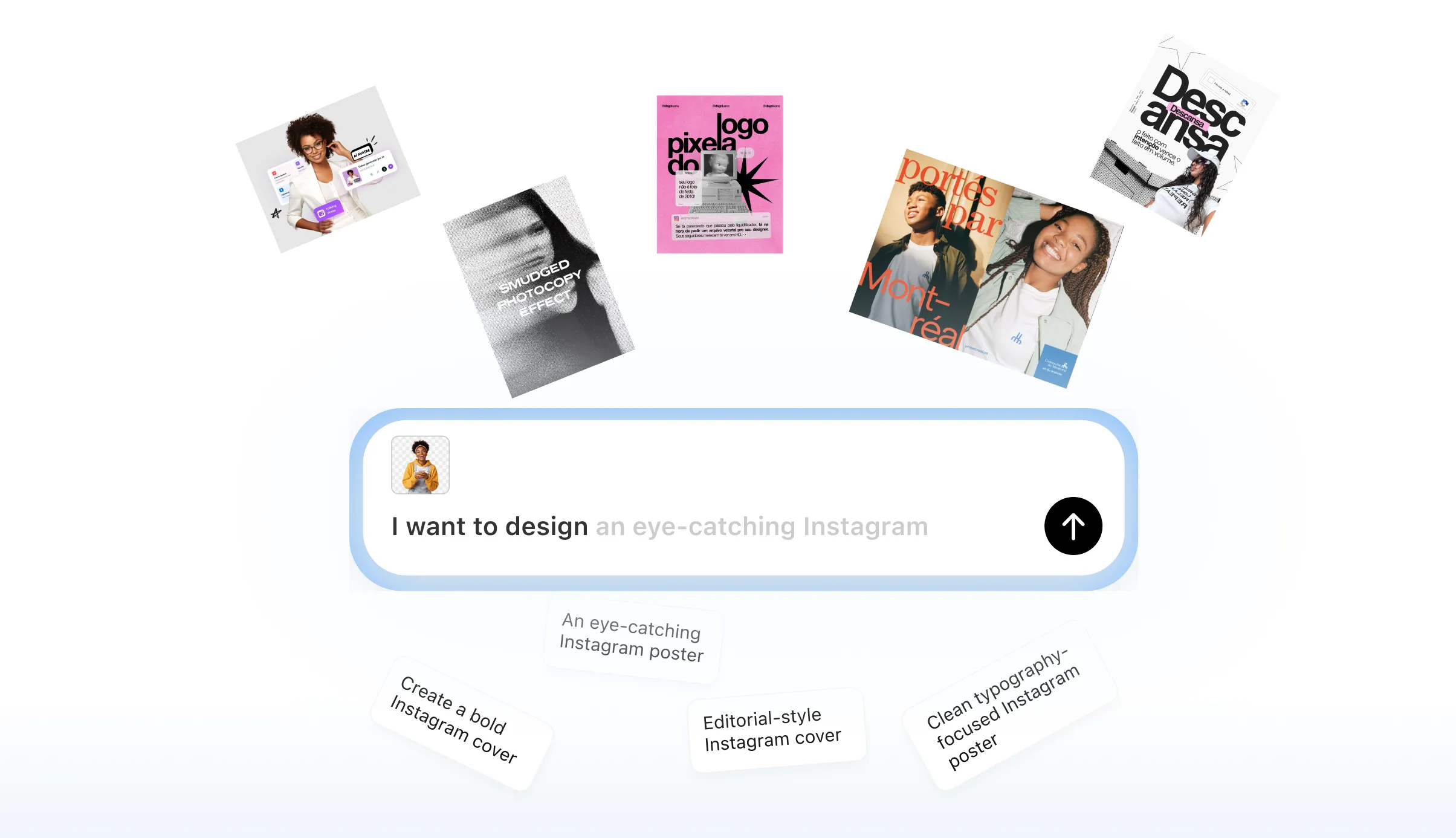
Export Retina-Ready Headers Without Blurry Renders
A header that looks sharp on a desktop monitor can appear soft and pixelated on a high-density phone screen. Designing at 2x resolution and exporting at the correct pixel density fixes this, but getting the math right every time takes discipline. A design tool that handles the 2x export rule removes one more variable from your pre-send checklist.
Try It Free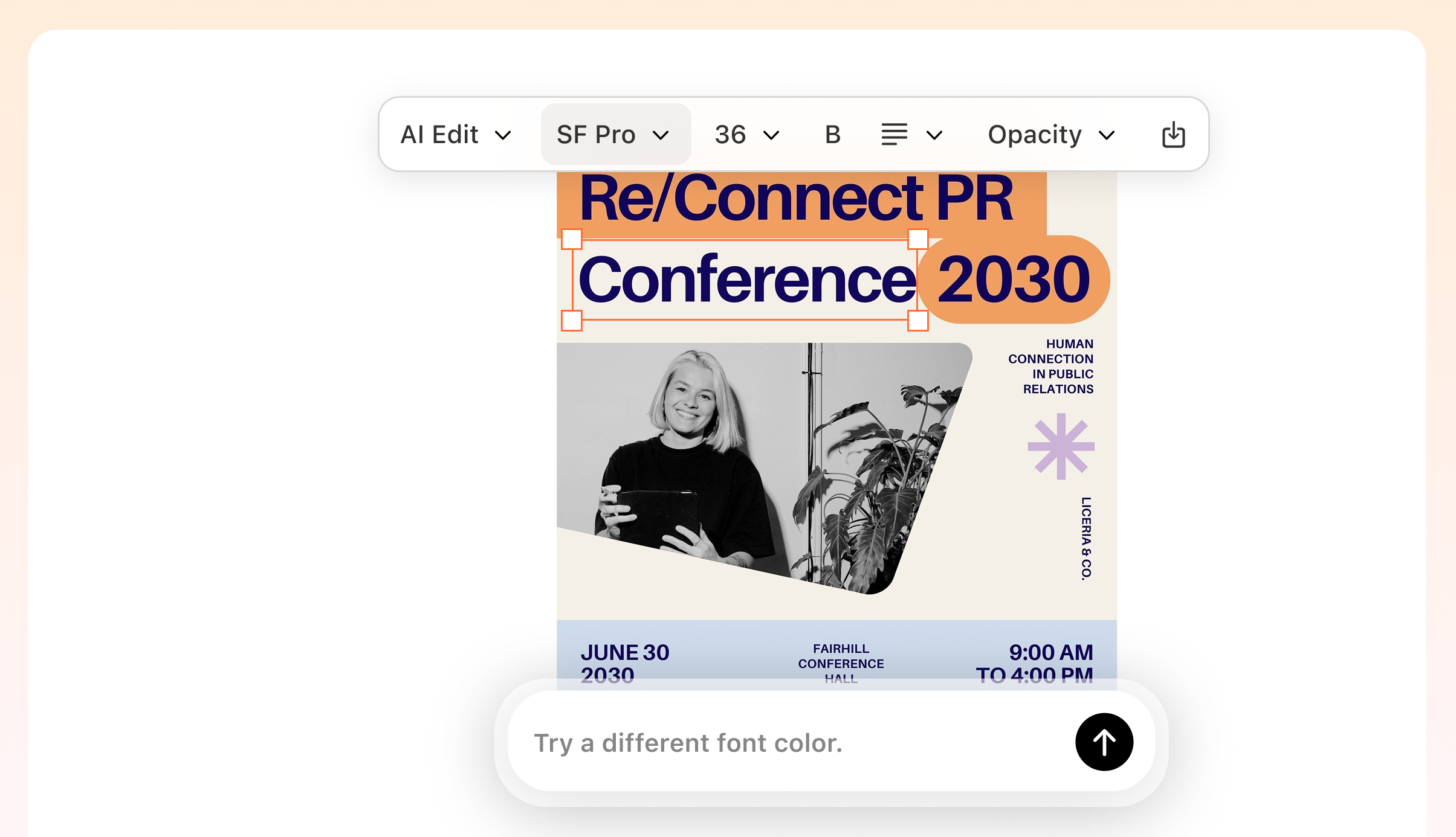
Center Your Focal Point So Every Viewport Looks Intentional
A 600 px desktop container and a 320 px mobile viewport show very different slices of the same header image. If your product shot or brand mark sits off-center, the narrowest viewports will crop it out entirely. Building your header with a centered focal point and a defined safe zone means the design holds together at every width.
Try It Free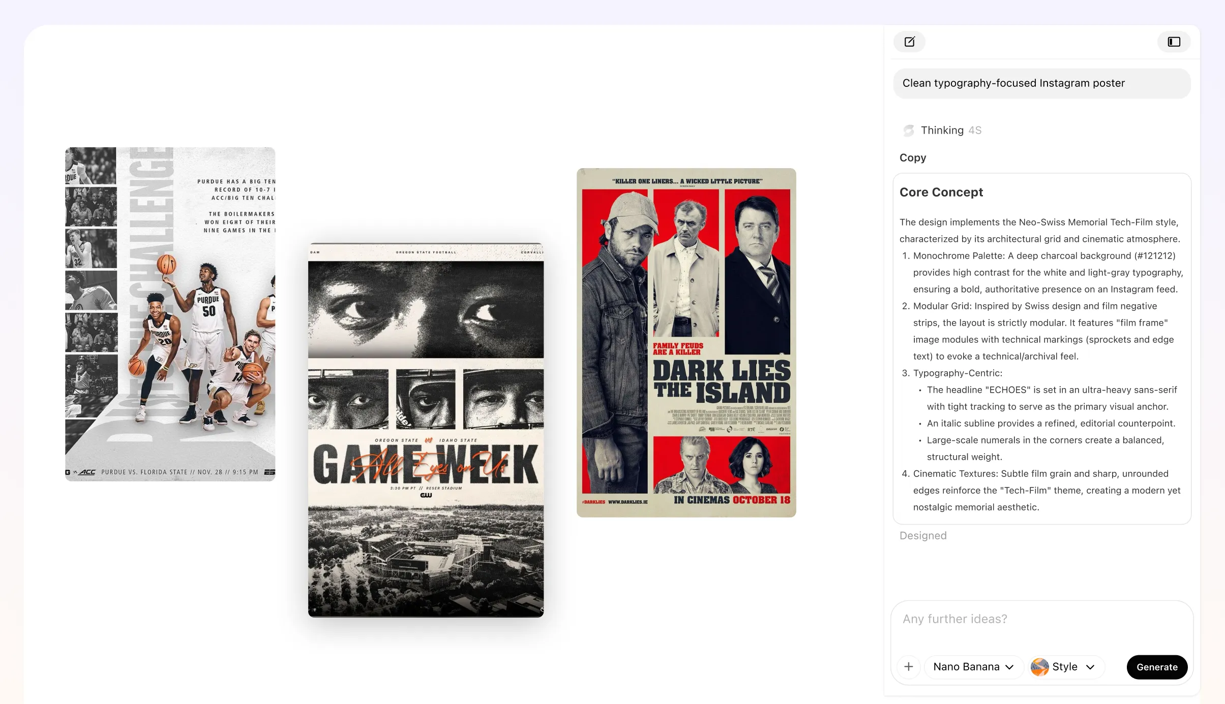
Swap Dimensions or Layouts Fast When Specs Change
Mailchimp, Klaviyo, and other platforms each publish slightly different recommended header banner dimensions, and those specs get updated. When you need to resize a header graphic or shift a text block back inside the safe zone, a fully editable layout lets you make that change in minutes rather than rebuilding from scratch.
Try It Free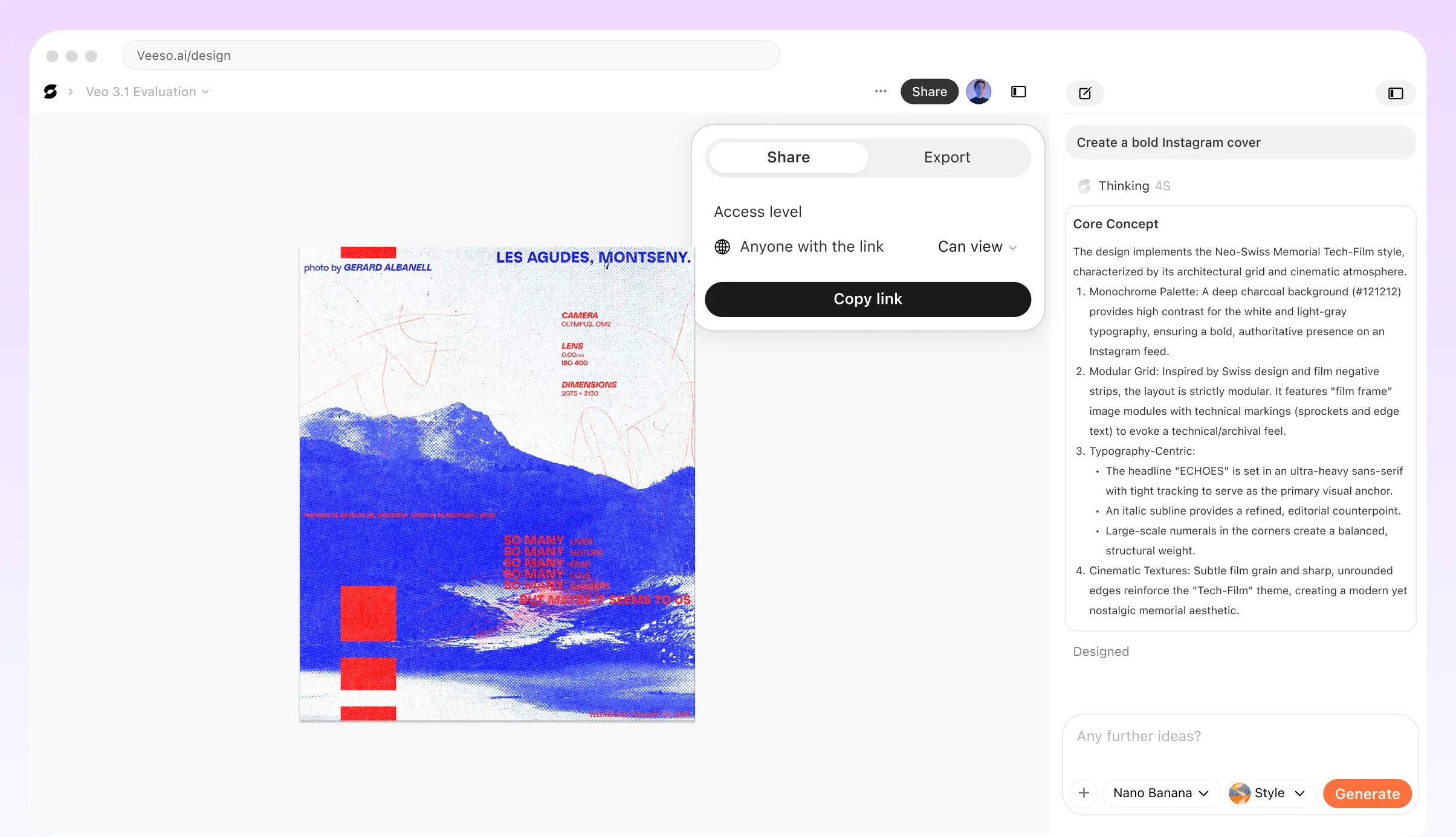
Who Needs an Email Header Dimensions and Mobile Crop Checklist?
E-commerce Brand Sending a Promotional Campaign
You've built a header with a bold discount callout and your logo, but on mobile the text sits dangerously close to the edge. Before you send to your list, map out the safe text zone: keep all critical copy and logos within the central 320px of a 600px-wide header. Anything outside that band risks cropping on smaller viewports. Check your image at 1200px tall maximum and confirm the focal point lands in the top 200px so it stays above the fold on most mobile clients without scrolling.
Nonprofit Running a Donation Drive Email
Donation emails live or die on first impressions, and a cropped header can bury your cause before anyone reads a word. Your header graphic should sit inside a max-width container of 600–640px, with the campaign headline centered and no closer than 60px from any edge. Because many supporters open email on older Android devices that ignore media queries, design the header so it communicates the message even at a narrower rendered width. Set a descriptive alt text fallback so image-blocking clients still receive your core message.
SaaS Company Launching a Product Update Announcement
Product update emails often include a UI screenshot or feature graphic inside the header. The risk is that retina mobile screens render your image at 2x pixel density, making an under-sized file look blurry. Export your header at double the display width, so a 600px display size means a 1200px source file, then cap file weight under 200KB to avoid slow load times. Confirm the product name and version callout stay inside the safe zone by previewing the header at 375px viewport width, which reflects common iPhone screen sizes.
Agency Designer Building a Reusable Header Template for a Client
When you hand off a header template to a client team, they need to swap artwork without breaking the layout on mobile. Document the safe zone dimensions clearly: a 600px container, text-safe area centered at roughly 400px wide, and a minimum top-padding of 20px so Gmail's clipping bar doesn't overlap the logo. If you use Veeso AI to build the initial header artwork, every layer stays editable, so the client can update copy or swap images without starting from scratch. Include a one-page spec sheet with the checklist baked in.
Event Organizer Promoting a Conference via Email
Conference headers usually carry a date, venue, and event name all at once. That's a lot of information to protect from mobile cropping. Stack the hierarchy vertically rather than spreading it horizontally, and keep the event name in the top third of the header image. Test the header inside both Gmail on Android and Apple Mail on iOS, since each client handles fluid image scaling differently. On Gmail, a max-width declaration in CSS helps prevent the image from stretching beyond 600px on tablet views, which would push your text out of the safe area.
Retail Franchise Standardizing Headers Across Multiple Store Locations
When dozens of store locations send their own email campaigns, inconsistent header dimensions create a patchwork of cropped logos and misaligned banners. A shared checklist solves this. Require all locations to submit header artwork at 1200x400px, keep the store name and any promotional text within a centered 400px-wide safe zone, and export as PNG under 150KB. Veeso AI can help each location produce a correctly sized, editable header from a shared style starting point, so the brand stays consistent even when local teams are building their own versions.
Why email marketers, graphic designers, and small business owners Choose Veeso AI
How to Create High-Converting pre-send email header crop checklist
Set Your Container Width and Confirm Your Retina Export Dimensions
Before you place a single element, lock your canvas to 600 px wide for desktop and plan to export at 1200 px for retina display rendering. This single decision determines whether every downstream dimension — safe zone, text placement, focal point — will actually hold up across devices.
Map the Safe Zone for Each Email Client You're Targeting
Draw or mark the pixel regions that iOS Mail, Gmail Android, and Outlook Mobile each clip on your header graphic. Design all critical text and brand elements to sit inside the most restrictive of those boundaries, so nothing important disappears on any client.
Center Your Focal Point and Test at 320 px and 425 px Viewport Widths
Resize your preview to the narrowest common mobile viewport — 320 px — and confirm that your headline, logo, and primary visual all remain visible and legible. If anything important sits outside the visible area at that width, reposition it before moving on.
Run the Full Pre-Send Crop Checklist and Export Your Final Header Graphic
Work through each line item: container width confirmed, safe zone text placement verified, focal point centered, dark mode contrast checked, alt text fallback written, and retina export at 2x resolution complete. Tools like Veeso AI let you make last-minute edits to any layer before you export the final high-resolution file for upload.
FAQ

Ready to Create Beautiful Mobile-Safe Email Banner Visuals with Veeso AI?
Start Creating NowNo credit card required • Free to start • No design skills required
Explore More AI Graphic Design Use Cases
Discover more creative design scenarios powered by Veeso AI.