Build a Preventive Care Reminder Campaign That Gets Patients In
Create clear, ready-to-use reminder materials for screenings, annual visits, and care gap outreach. Describe your campaign and get structured visual content built around your message. Export print-ready files your team can use right away.
Three Ways to Generate preventive care reminder visual sets
Describe Your Outreach Scenario and Generate a Reminder Layout
Tell the tool what screening you're promoting, who the audience is, and what action you want patients to take. It builds a structured visual layout around your copy so you're not staring at a blank page. This works especially well when your team already knows the message but needs a fast path to a designed, print-ready asset.
- Paste your reminder copy and get a formatted layout sized for mailed cards or flyers
- Specify the screening type and the tool adjusts visual hierarchy to surface the CTA first
- Output includes editable text boxes so you can refine condition-specific language after generation
- Export as high-resolution PDF ready for a print vendor or in-clinic printer
Start from a Preventive Care Reminder Template and Customize
Pick a starting layout built for health outreach, then swap in your clinic name, screening details, appointment prompt, and brand colors. Templates give you a proven visual structure so you're not guessing at spacing, font size, or where to place the phone number. This method is fastest when you're producing multiple reminder formats for the same campaign.
- Choose from layouts sized for mailed reminder cards, waiting-room posters, and table tents
- Replace placeholder copy with your own screening-specific messaging in each text layer
- Adjust colors and logo placement to match your health plan or clinic brand standards
- Duplicate the layout across formats to build a coordinated multi-touch visual set
Import Your Existing Campaign Copy and Turn It Into Designed Pages
If your care team already drafted reminder text in a Word doc or PDF toolkit, you don't need to retype it. Import the document and the tool structures it into visual pages you can edit, reorder, and export. This is the right method when you're working from an existing health promotion campaign toolkit or adapting materials from a prior outreach cycle.
- Import Word, PDF, or Markdown files containing your reminder copy and screening details
- Content flows into structured visual layouts with proper heading hierarchy and CTA placement
- Every imported text block stays editable so you can adjust reading level or add next-step prompts
- Export individual pages as separate print files or as a single coordinated campaign packet
Why choose Veeso for your coordinated care outreach design assets
Keep Every Reminder Visually Consistent Across a Multi-Touch Sequence
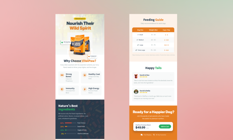
When a patient receives a mailed card, then sees a poster in the waiting room, then picks up a take-home flyer, those three pieces need to look like they belong together. Visual inconsistency breaks trust and makes patients less likely to act. A design tool that produces coordinated care outreach assets from the same layout system keeps your messaging coherent from first contact to scheduled appointment.
Try It Free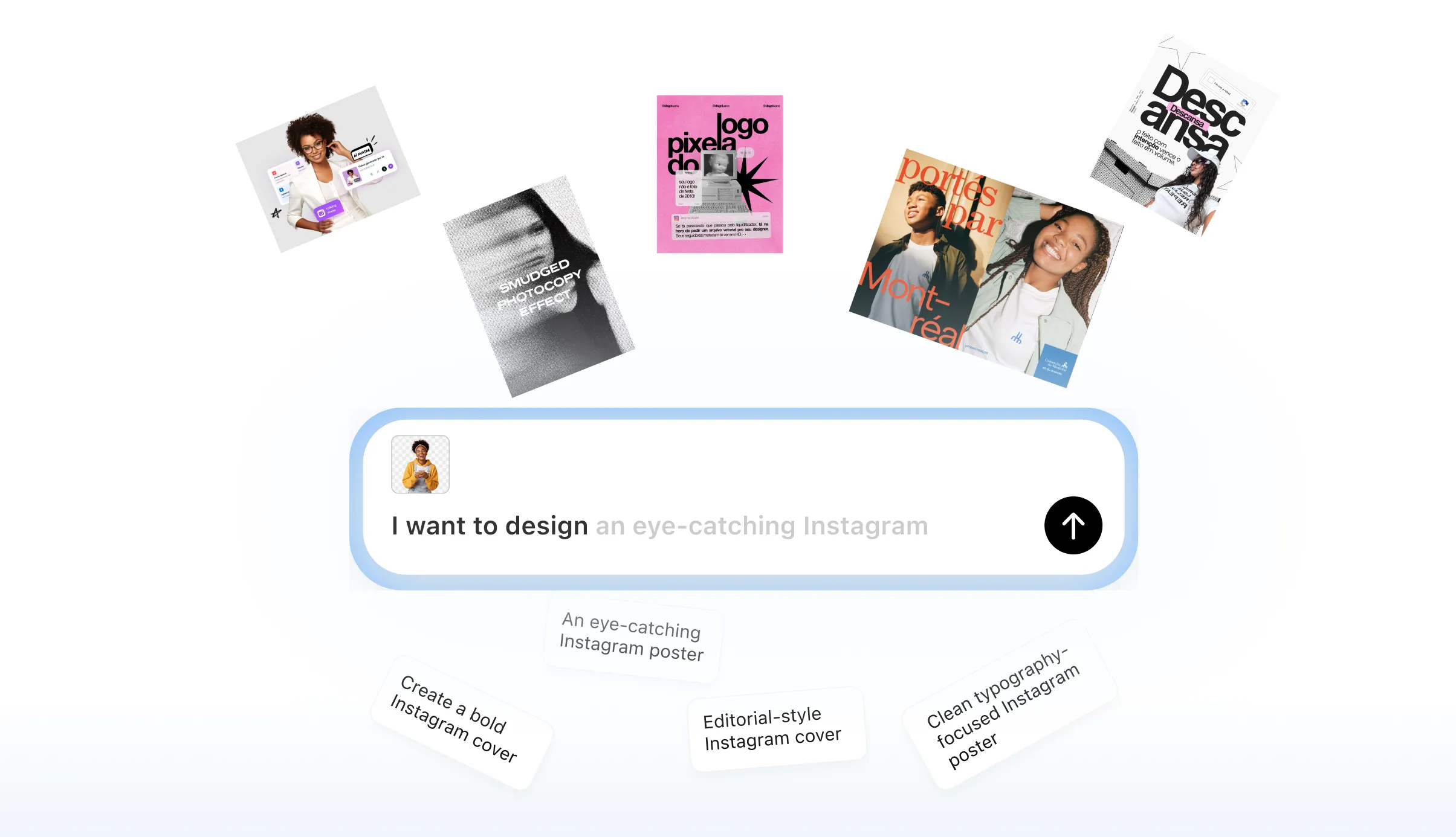
Match Message Density to the Right Preventive Screening Format
A colorectal screening mailer needs different copy weight than an annual wellness visit poster. Cramming too much text onto a reminder card is one of the most common reasons patients ignore it. Starting from a format-specific layout helps you fit the right amount of information to the right surface, whether that's a table tent, a door-hanger card, or a campaign packet insert.
Try It Free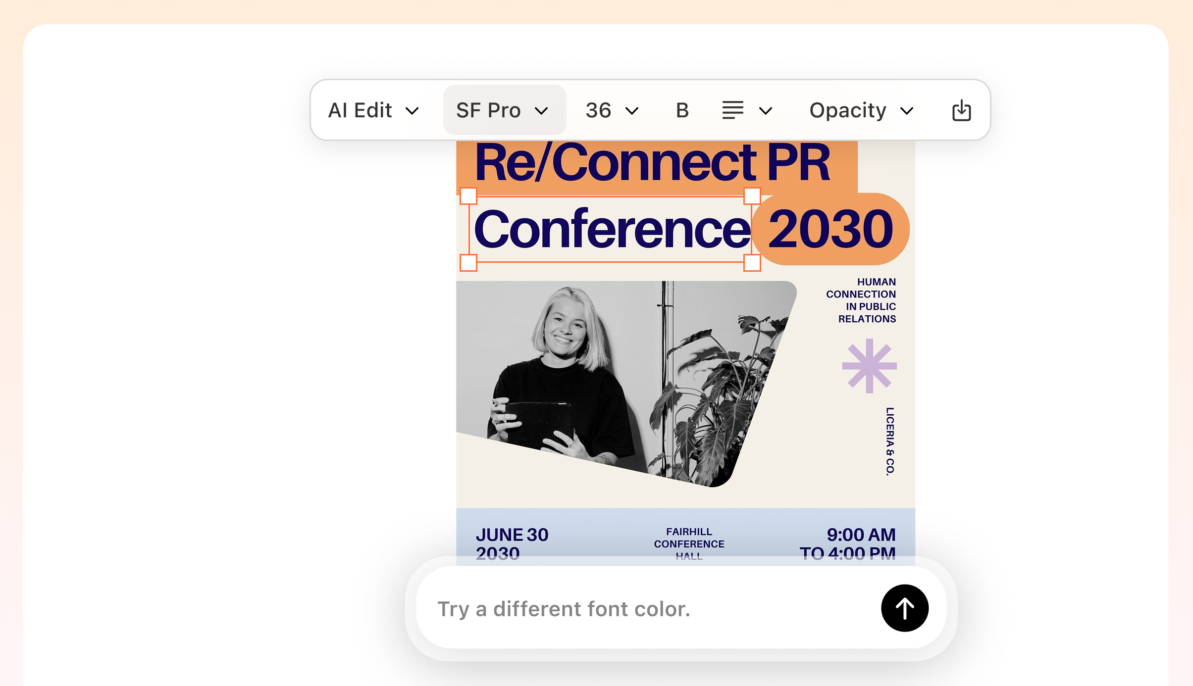
Produce Print-Ready Assets Without a Dedicated Graphic Designer
Most clinic and health plan teams write their own outreach copy but don't have a designer on staff to turn it into print-ready files. Waiting on outside vendors slows down care gap closure campaigns, especially when HEDIS measure deadlines are approaching. A content-first design tool lets your care coordination team go from approved copy to a high-resolution PDF without a design handoff.
Try It Free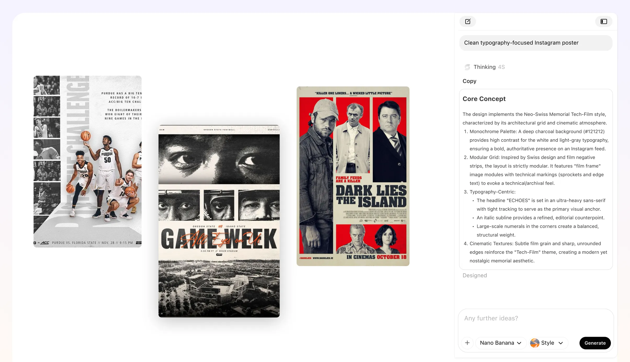
Update Condition-Specific Language Without Rebuilding the Whole Layout
Preventive care outreach rarely uses one message for every patient population. A reminder targeting members overdue for a diabetes screening reads very differently from one promoting blood pressure checks. Fully editable layouts let you swap condition-specific language, swap supporting images, and adjust the call-to-action prompt without starting from scratch each time.
Try It Free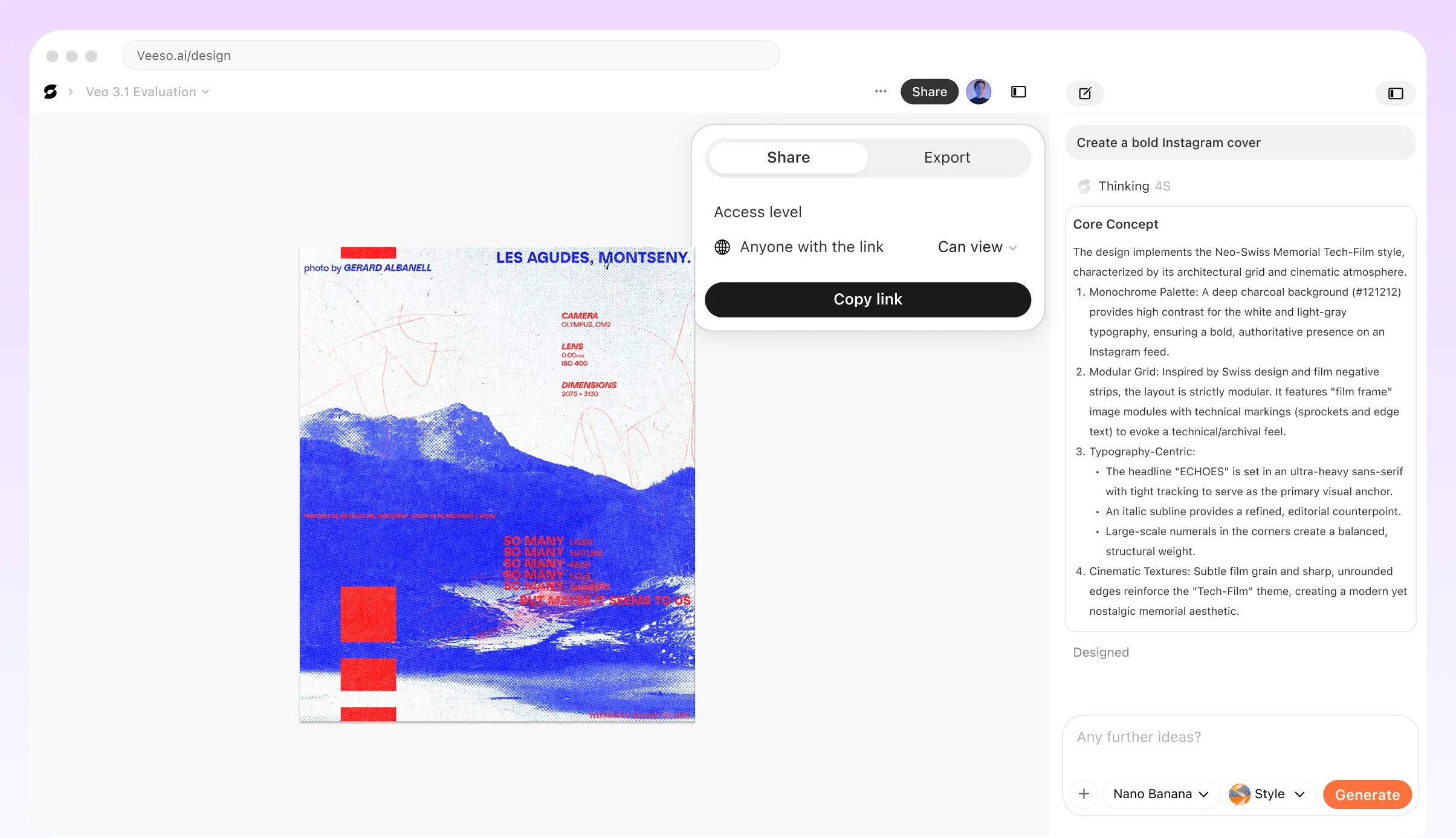
Who Uses a Preventive Care Reminder Campaign Generator?
Annual Wellness Visit Outreach for Health Plan Members
Health plans managing HEDIS measure outreach often struggle to reach members who haven't completed their annual wellness visit before the measurement year closes. A preventive care reminder campaign built around this deadline needs clear messaging about what the visit covers, who qualifies, and exactly how to schedule. Reminder materials should address common hesitations, like cost concerns, by confirming the visit is covered in full. Each piece in the sequence should carry a direct scheduling prompt so members know the next step without having to search for it.
Cancer Screening Recall Campaign for Community Health Centers
Community health centers serving underinsured populations often face significant care gaps in cancer screening compliance, particularly for colorectal, cervical, and breast cancer. A preventative screening outreach campaign for this audience needs plain-language copy, culturally relevant framing, and a clear call to action that removes barriers to booking. Print flyers, waiting room posters, and take-home reminder cards are practical formats here. Veeso AI can help care teams turn approved messaging into print-ready visual assets quickly, keeping branding consistent across every format without requiring a dedicated designer.
Diabetes and Blood Pressure Screening Reminders for Employer Wellness Programs
Employers running workplace wellness programs often need to remind employees about preventive screenings for conditions like type 2 diabetes and high blood pressure. These reminders work best when they feel relevant rather than clinical, so framing them around energy, productivity, and long-term wellbeing tends to drive better engagement than medical language alone. A coordinated reminder sequence might include a kickoff notice, a mid-campaign nudge, and a final scheduling prompt. Each touchpoint should name the specific screening, explain why it matters, and tell employees exactly where and when to go.
Pediatric Preventive Care Reminders Targeted at Parents
Pediatric practices closing care gaps for well-child visits and childhood immunizations need reminder content that speaks directly to parents, not patients. The tone should be warm and reassuring, and the message should focus on what the visit includes and why the timing matters for the child's development. A multi-step patient recall campaign for this audience might start with a mailed reminder card, followed by a take-home summary after the visit that outlines what's due next. Keeping the visual design consistent across both pieces helps parents recognize and trust the materials.
Preventive Screening Reminder Toolkit for Rural and Federally Qualified Health Centers
Rural clinics and federally qualified health centers often coordinate preventive care outreach across multiple sites with limited staff. A health promotion campaign toolkit built for this context needs materials that work across print and digital channels without requiring heavy customization at each location. Veeso AI lets care coordinators adapt a core set of editable reminder templates by site name, screening type, or patient demographic, producing consistent assets that each location can use immediately. The focus stays on closing care gaps efficiently rather than rebuilding materials from scratch for every outreach cycle.
Multi-Channel Preventive Care Reminder Sequence for Accountable Care Organizations
Accountable care organizations managing population health across large patient panels need a preventive screening reminder workflow that coordinates messaging across care teams, community partners, and health plan contacts. A well-structured sequence moves patients from initial awareness through appointment scheduling in clear stages, with each message building on the last. Reminder content should vary by care gap type, whether that's a missed mammogram, an overdue HbA1c test, or a skipped annual visit, so patients receive information that's directly relevant to their situation rather than a generic outreach blast.
Why clinic care coordinators, health plan member engagement managers, and community health outreach staff Choose Veeso AI
How to Create High-Converting multi-touch reminder campaign visuals
Map Your Reminder Sequence Before You Design Anything
Decide how many touchpoints your care gap closure campaign needs and what each one should communicate. A three-stage sequence typically starts with an initial awareness piece, follows up with a scheduling nudge, and closes with an in-clinic escalation prompt. Writing out the goal and CTA for each stage before opening a design tool saves you from rebuilding layouts mid-campaign.
Choose a Format for Each Stage of Your Preventive Screening Reminder Workflow
Match the visual format to the delivery channel at each stage. A mailed reminder card works for initial outreach, a waiting-room poster reinforces the message for patients already in the building, and a printed take-home flyer gives patients something to act on after the visit. Picking the right format first means your layout dimensions and message density are correct from the start.
Build and Edit Your Visual Assets Using Your Approved Copy
Paste your reminder copy, import an existing draft, or start from a template to generate your designed layout. Tools like Veeso AI let you edit every text box, image, and layer so you can fine-tune condition-specific language, adjust the visual hierarchy, and make sure the appointment scheduling prompt is the first thing a patient's eye lands on.
Export Print-Ready Files for Each Touchpoint in Your Campaign
Export each reminder asset as a high-resolution PNG or PDF sized for its intended format, whether that's a standard mailer, a letter-size flyer, or a folded table tent. Send the files to your print vendor or share them with the clinic team for in-house printing. Keep the editable source files so you can update screening dates or phone numbers for the next outreach cycle without redesigning from scratch.
FAQ

Ready to Create Beautiful Coordinated Care Outreach Design Assets with Veeso AI?
Start Creating NowNo credit card required • Free to start • No design skills required
Explore More AI Graphic Design Use Cases
Discover more creative design scenarios powered by Veeso AI.